
Multi-panel plots and figures are used everywhere, especially in scientific papers to compare different graphs or datasets. And creating them has never been easier using R!
There are several functions and ways in which you can create multi-panel plots/figures, and in this guide I will show you how to use the layout() function (available in the base installation) to create them.
Guide Information
| Title | Creating multi-panel plots and figures using layout() |
| Author | Benjamin Bell |
| Published | February 14, 2018 |
| Last updated | |
| R version | 3.4.2 |
| Packages | base |
| Navigation |
Simple multi-panel plots using layout()
This guide will focus on the layout() function in R, and will show you how to use it effectively to create multi-panel plots and figures. Check the ?layout help page for further details about the function, or take a look at the associated research paper.
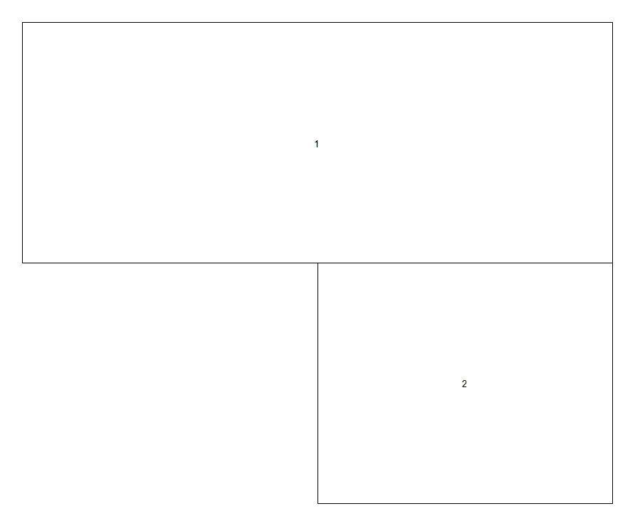
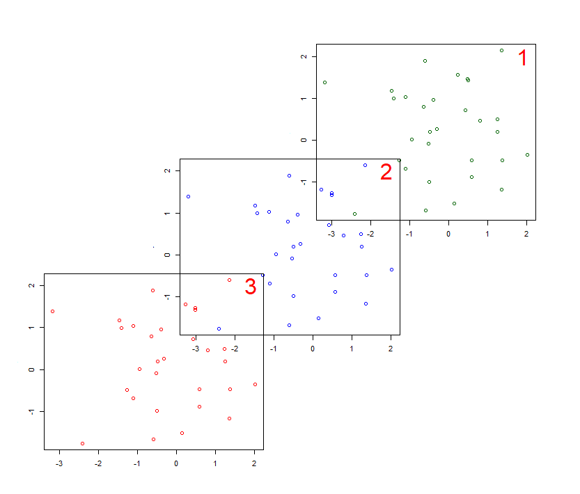
First, it is important to understand the "graphics device" in R. A graphics device in R might refer to a file type or what appears on screen - see library(help = "grDevices") for a list of graphic devices for your system. Unless you tell R otherwise, when you use the plot() function (or similar graphical function), R will output the command to the screen, creating a new graphical window which will contain the plot or figure.
The onscreen graphic device is made up of three regions: the device region, figure region, and plot region (see the figure below). An understanding of these regions is important when it comes to planning the layout of your multi-panel plots.
# Set up margins by number of lines
par(mar=c(5, 5, 5, 5), oma=c(5, 5, 5, 5))
# Plot
plot(x, y)
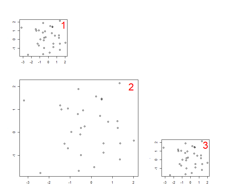
Back to the layout() function, for the first example, we'll create a simple 6-panel plot (we'll also create some random data to plot).
# Generate some random data
x <- rnorm(30)
y <- rnorm(30)
h <- rnorm(500)

# Simple 6 panel figure
layout(matrix(1:6, ncol=3))
par(oma=c(4, 4, 4, 4), mar=c(4, 4, 4, 4))
plot(x, y)
hist(h)
plot(x, y)
hist(h)
plot(x, y)
hist(h)
title(main="Simple 6 panel figure", outer=TRUE, cex.main=2)
This code will result in a figure showing 6 plots, which will be arranged in column order. To demonstrate the device, figure and plotting regions, I have also added borders to the figure, as well as plot numbers.
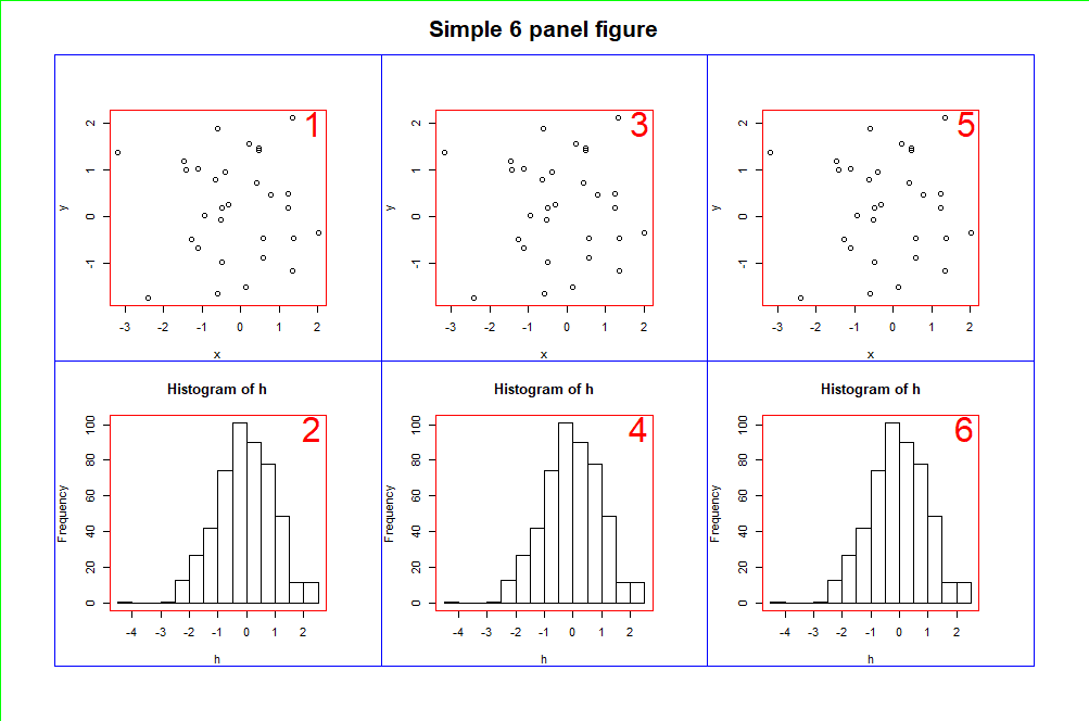
layout() uses a matrix() to arrange the plots in the figure. So, in this example, we created a matrix using the numbers 1 to 6, arranged over 3 columns.
> matrix(1:6, ncol=3)
     [,1] [,2] [,3]
[1,]    1    3    5
[2,]    2    4    6
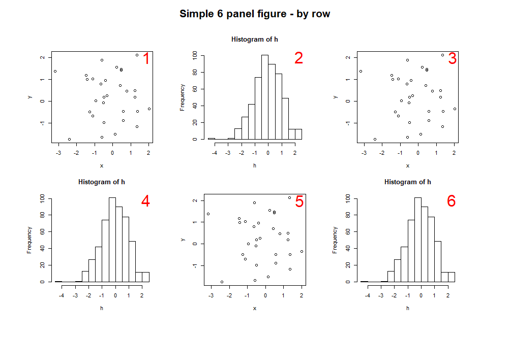
So, the first plot will appear where the cell containing "1" is, while the second plot appears where the cell containing "2" is, and so on. By default, a matrix is created in column order. To create a 6 panel plot, but organised by rows, use the following code:
layout(matrix(1:6, ncol=3, byrow=TRUE))
par(oma=c(4, 4, 4, 4), mar=c(4, 4, 4, 4))
Which will re-arrange the matrix, and result in the following plot:
> matrix(1:6, ncol=3, byrow=TRUE)
     [,1] [,2] [,3]
[1,]    1    2    3
[2,]    4    5    6
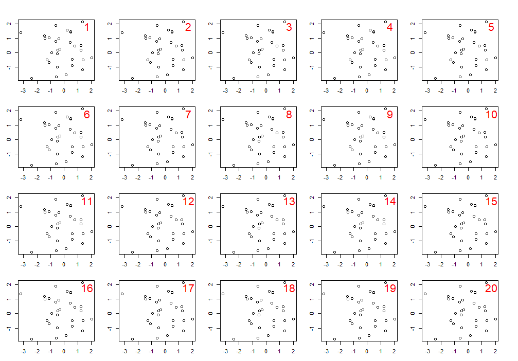
You can create a multi-panel figure using up to 200 rows and columns. Here's an example of a figure with 20 plots over 4 rows and 5 columns:
In these examples, before plotting we set the outer margins oma, and plot margins mar arguments using the par() function. Setting this once will control the margins for all the plots within the figure. You can change individual plot margins by specifying the mar argument par(mar=c(x, x, x, x)) each time before you use plot(). The numbers following the margin arguments, oma=c(4, 4, 4, 4) and mar=c(4, 4, 4, 4) tell R that the margin should be 4 lines wide on all sides of the figure and plot regions respectively. The order for the margins is always: bottom (side 1), left (2), top (3), right (4). You can use different width margins on different sides.
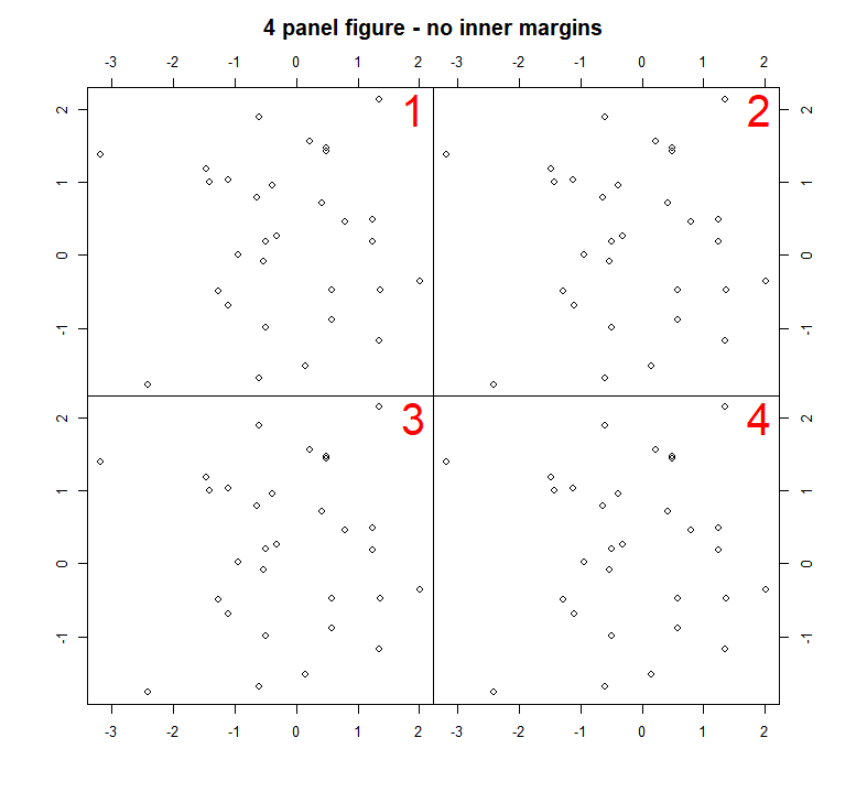
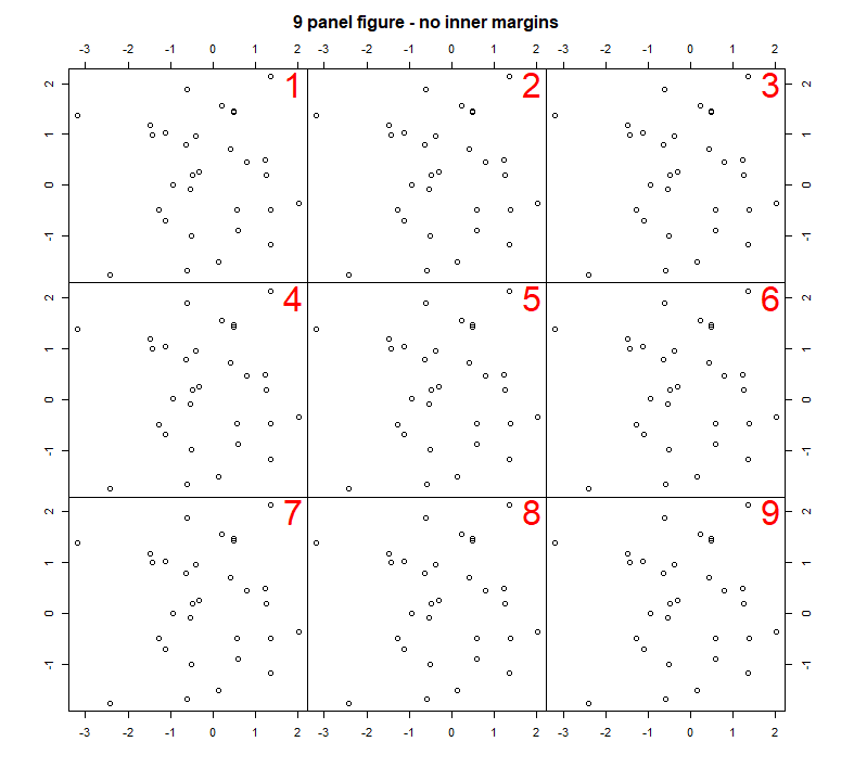
Next, we'll create a 4 panel figure with no plot margins, leaving only the outer margin. We'll change the position of the plot axes so they appear in the outer margins by specifying each axis() separately.
# 4 Panel plot, no plot margins
layout(matrix(1:4, ncol=2, byrow=TRUE))
par(oma=c(5, 5, 5, 5), mar=c(0, 0, 0, 0))
# Plot 1
plot(x, y, axes=FALSE)
axis(2)
axis(3)
box()
# Plot 2
plot(x, y, axes=FALSE)
axis(3)
axis(4)
box()
# Plot 3
plot(x, y, axes=FALSE)
axis(1)
axis(2)
box()
# Plot 4
plot(x, y, axes=FALSE)
axis(1)
axis(4)
box()
Which results in the following plot:
You could adjust the code to create a similar figure, but with 9 plots:
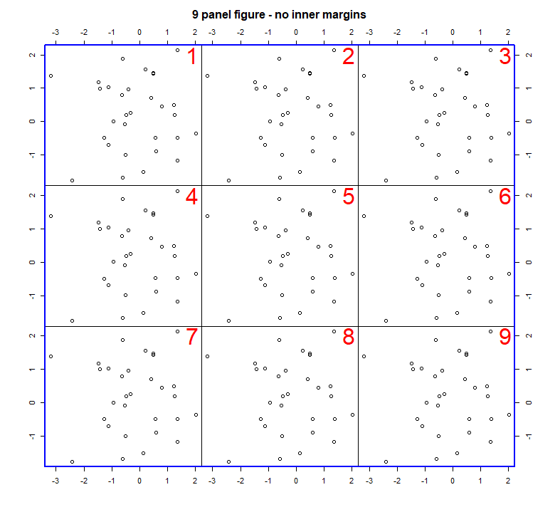
In these examples we used box() after each plot() command to draw a box around each plot. There are lots of options for customising the style of the box that is drawn, and where it is drawn. See ?box for details. If for example, you wanted to draw a blue box around all the plots, use the following command after you have plotted all your plots.
box(which="inner", col="blue", lwd=2)
Changing widths and heights of plots
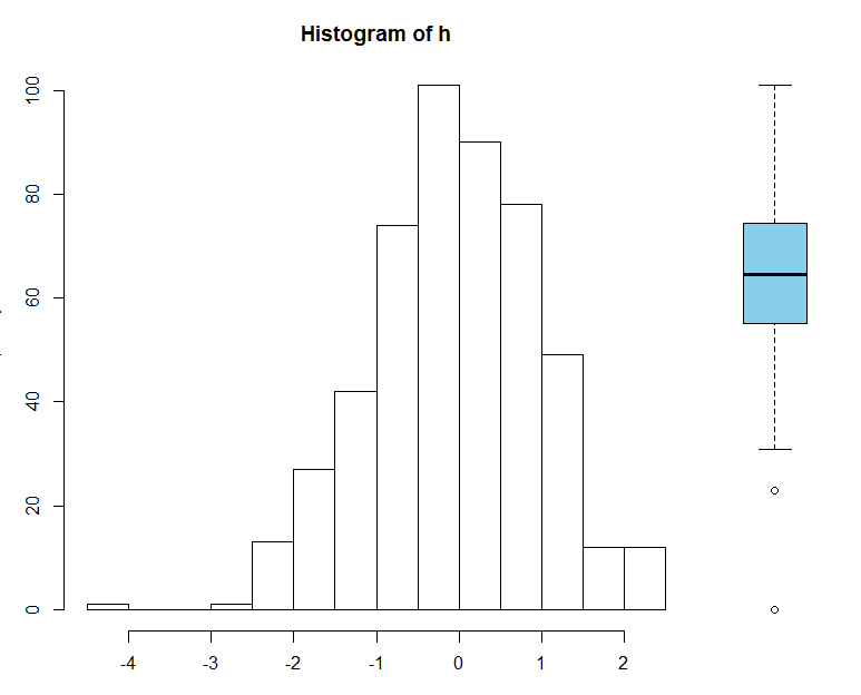
To change the width of height of each plot within the figure, you can use the optional widths and heights arguments. These should be a vector of values for each column (width) and each row (height). To create a multi-panel figure with different widths use:
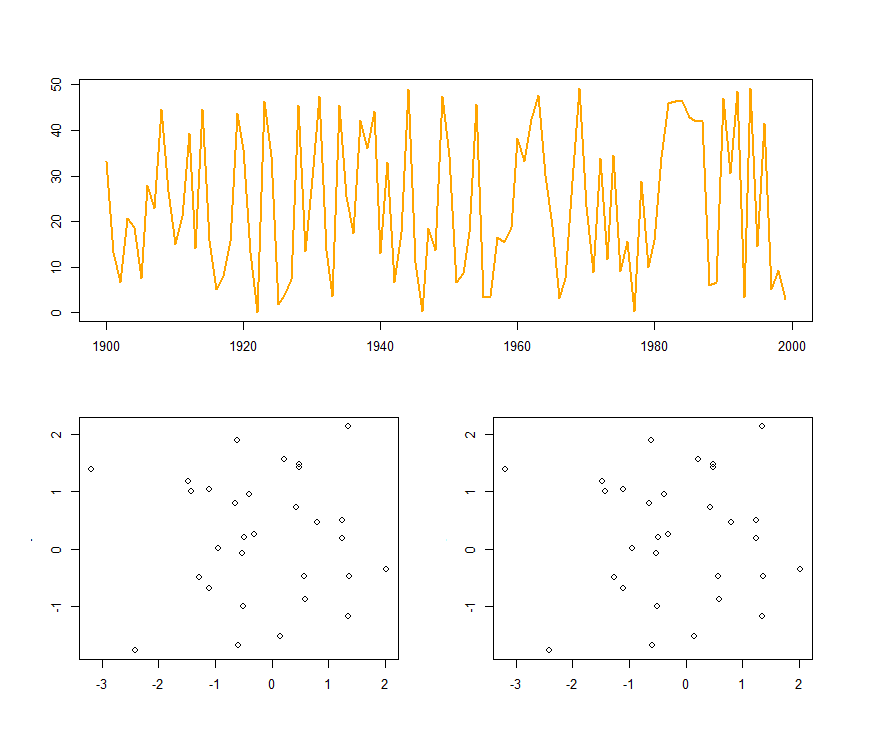
# Relative widths
layout(matrix(1:2, ncol=2), widths=c(2, 0.5))
par(mar=c(3, 3, 3, 0))
hist(h)
par(mar=c(3, 0, 3, 0))
boxplot(h, col="skyblue", axes=FALSE, ann=FALSE)
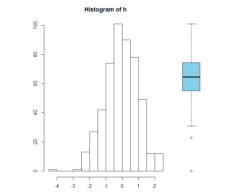
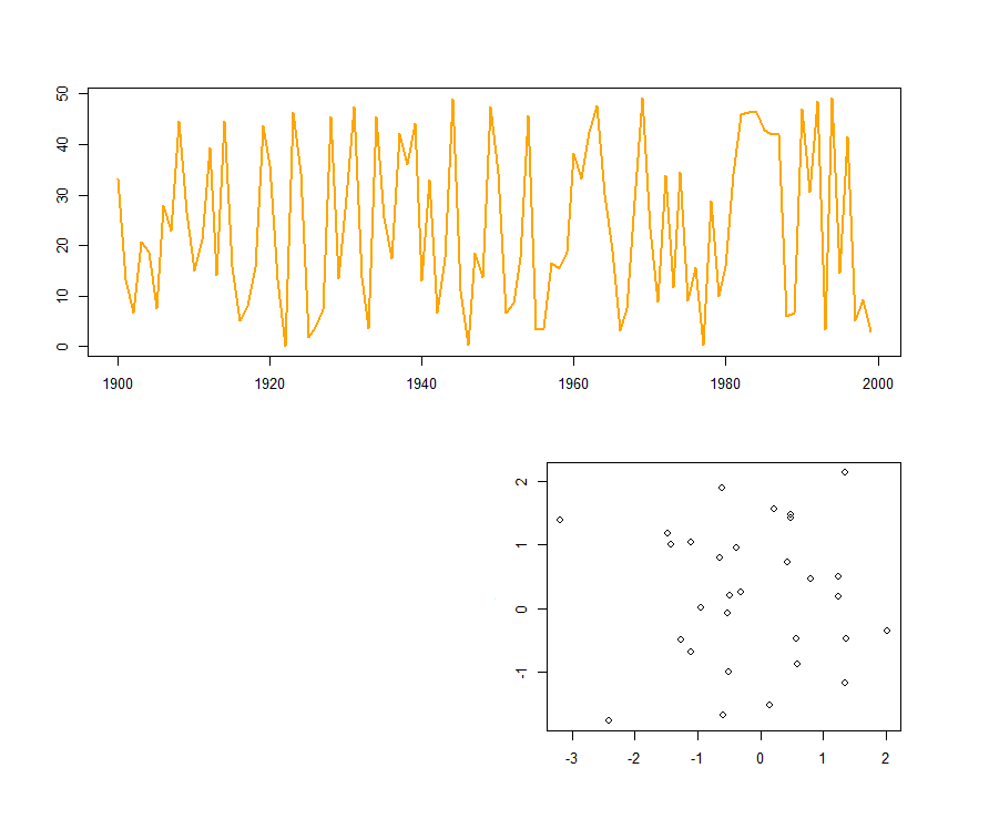
This will change the relative width of the columns - if you resize the plot window, you'll see the width of the individual plots also changes. To specify absolute widths, use lcm() (that's "l" the letter, not "1" the number):
# Absolute widths
layout(matrix(1:2, ncol=2), widths=c(lcm(12), lcm(4)))
par(mar=c(3, 3, 3, 0))
hist(h)
par(mar=c(3, 0, 3, 0))
boxplot(h, col="skyblue", axes=FALSE, ann=FALSE)
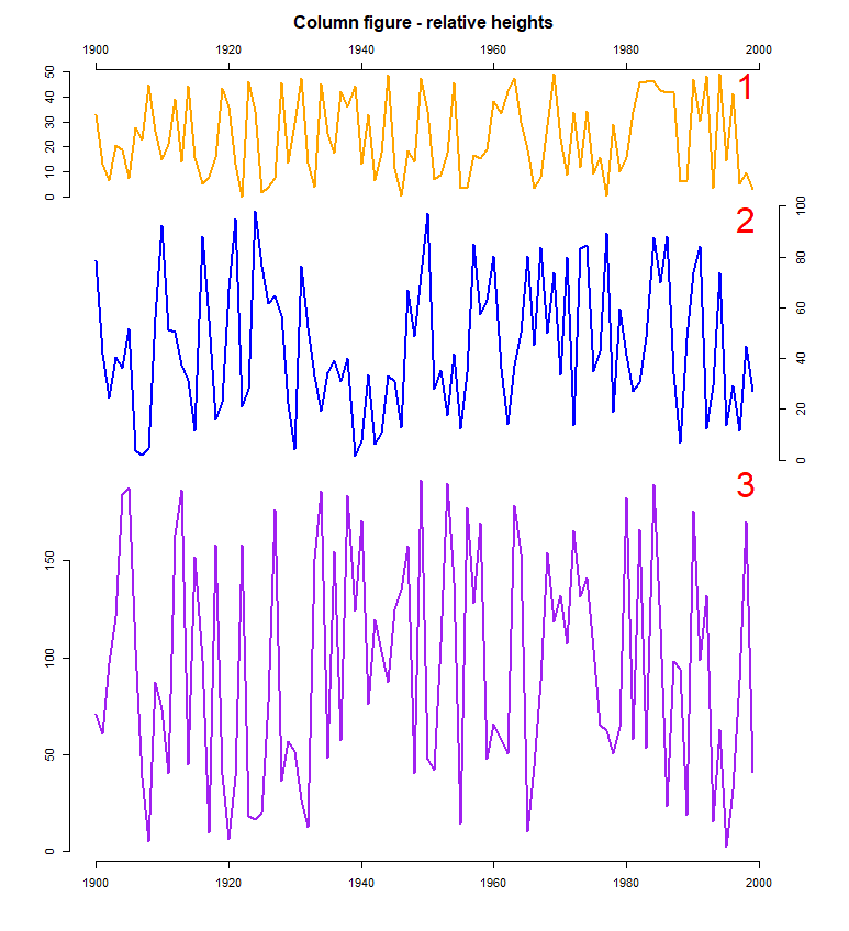
The height of each row can also be specified as either relative or absolute values. For this example, we'll create a single column figure with relative heights for each plot, and we'll alter the position of each plots axis. (We'll also create some random time series data to plot).
# Generate random time series data
f1 <- runif(100, min=0, max=50)
f1.t <- ts(f1, start=1900, frequency=1)
f2 <- runif(100, min=0, max=100)
f2.t <- ts(f2, start=1900, frequency=1)
f3 <- runif(100, min=0, max=200)
f3.t <- ts(f3, start=1900, frequency=1)

# 1 column figure with 3 plots using relative heights
layout(matrix(1:3, ncol=1), heights=c(1, 2, 3))
par(oma=c(5, 5, 5, 5), mar=c(0, 0, 0, 0))
# Plot 1
plot(f1.t, col="orange", axes=FALSE, lwd=2)
axis(2)
axis(3)
# Plot 2
plot(f2.t, col="blue", axes=FALSE, lwd=2)
axis(4)
# Plot 3
plot(f3.t, col="purple", axes=FALSE, lwd=2)
axis(1)
axis(2)
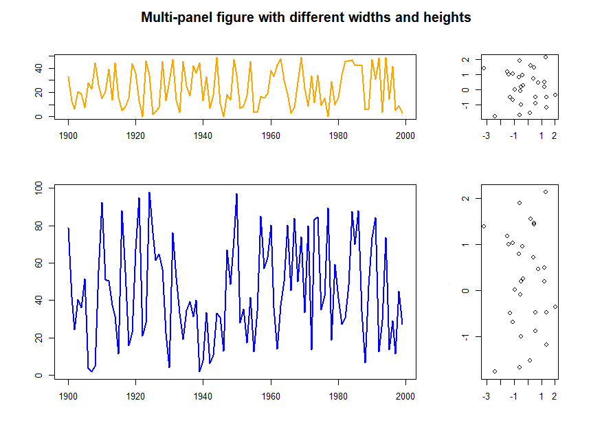
To change both widths and heights, use the following code:
# Different width and heights
layout(matrix(1:4, ncol=2, byrow=TRUE), widths=c(3, 1), heights=c(1, 2))
par(oma=c(2, 2, 2, 2), mar=c(3, 3, 3, 3))
plot(f1.t, col="orange", lwd=2)
plot(x, y)
plot(f2.t, col="blue", lwd=2)
plot(x, y)
Advanced layouts
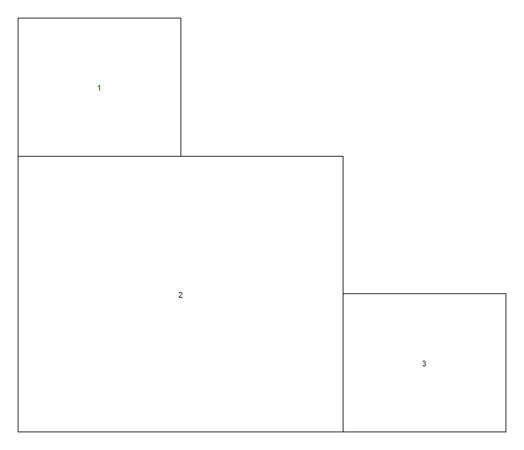
So far we have created fairly simple plot layouts. It is possible to create more advanced layouts by thinking of the figure region as a grid, and for each grid cell, specifying which plot should appear in it. In the previous examples we created a matrix (our layout "grid") using a series of ordered numbers arranged by column or row. Let's instead create the matrix by specifying a value for each cell which will determine which plot goes where.
> matrix(c(1, 2,  1, 3), ncol=2)
     [,1] [,2]
[1,]    1    1
[2,]    2    3
Or, you could create the matrix by row:
> matrix(c(1, 1,  2, 3), ncol=2, byrow=TRUE)
     [,1] [,2]
[1,]    1    1
[2,]    2    3
Thinking in terms of a grid - using this matrix with layout() would result in plot 1 appearing in the top two grid cells, with plots 2 and 3 appearing in the bottom grid cells. The following code and resulting plot should make this clearer:
layout(matrix(c(1, 2,  1, 3), ncol=2))
plot(f1.t, col="orange", lwd=2)
plot(x, y)
plot(x, y)
If you want one of your "grid cells" to be blank, use a value of "0" when creating the matrix.
> matrix(c(1, 0,  1, 2), ncol=2)
     [,1] [,2]
[1,]    1    1
[2,]    0    2
layout(matrix(c(1, 0,  1, 2), ncol=2))
plot(f1.t, col="orange", lwd=2)
plot(x, y)
Inputting the matrix into the R console is a good way to visualise the plot layout for your figure. You can also use layout.show() to visualise the plot layout after inputting the layout() command. e.g.
layout(matrix(c(1, 0,  1, 2), ncol=2))
layout.show(2)
If you create the matrix as its own object, you can simply specify its name when using layout(), this can be useful if reusing the same layout lots of times, or to edit fix() or visualise the matrix. Here's an example of another "advanced layout"
# Create  matrix
m1  <- matrix(c(1, 2, 2,  0, 2, 2,  0, 0, 3), ncol=3, nrow=3)
# Set layout
layout(m1)
# Plot
plot(x, y)
plot(x, y)
plot(x, y)
Input the matrix into the R console, or use layout.show(3) to help visualise the plot arrangement.
> m1
     [,1] [,2] [,3]
[1,]    1    0    0
[2,]    2    2    0
[3,]    2    2    3
Here's a really advanced layout:
m2  <- matrix(c(1, 2, 3, 3,  4, 5, 3, 3,  4, 0, 6, 7,  4, 0, 8, 8), ncol=4, nrow=4)
layout(m2)
plot(x, y)
plot(x, y)
...
> m2
     [,1] [,2] [,3] [,4]
[1,]    1    4    4    4
[2,]    2    5    0    0
[3,]    3    3    6    8
[4,]    3    3    7    8
It is also possible to create overlapping plots (should you wish!).
m3  <- matrix(c(0, 0, 1, 1,  0, 2, 1, 1,  3, 2, 2, 0,  3, 3, 0, 0), ncol=4, nrow=4, byrow=TRUE)
layout(m3)
plot(x, y, col="darkgreen")
plot(x, y, col="blue")
plot(x, y, col="red")
Viewing the matrix might make this layout easier to understand.
> m3
     [,1] [,2] [,3] [,4]
[1,]    0    0    1    1
[2,]    0    2    1    1
[3,]    3    2    2    0
[4,]    3    3    0    0
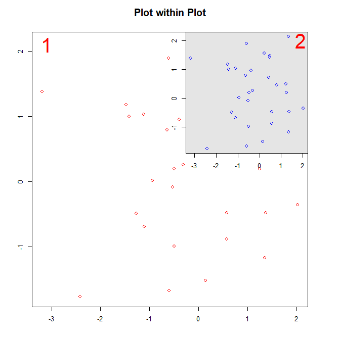
Plot within a plot
If you wanted to place a plot within a larger plot (e.g. putting a regional map in the corner of a large local map). You can do this with layout() by creating a matrix with at least 4 cells (2 columns and rows), with "1" in each cell, except for the corner that you want the smaller plot to appear. This cell should contain "2" e.g.
m4 <- matrix(c(1, 2, 1, 1), ncol=2, byrow=TRUE)
Which will look like this in the R console:
> m4
     [,1] [,2]
[1,]    1    2
[2,]    1    1
Use the following code to create the figure:
layout(m4)
par(oma=c(2, 2, 2, 2), mar=c(2, 2, 2, 2))
# Main plot
plot(x, y, col="red")
# Inner plot
plot(x, y)
# Create a grey background
rect(par("usr")[1], par("usr")[3], par("usr")[2], par("usr")[4], col="gray90")
# Replot the data points
points(x, y, col="blue")
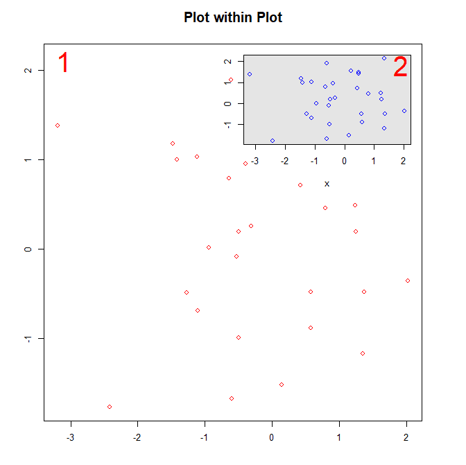
You can adjust the position and size of the inner plot by changing its plot margins par(mar). For example:
layout(m4)
par(oma=c(2, 2, 2, 2), mar=c(2, 2, 2, 2))
plot(x, y, col="red")
# Change inner plot margins to alter position/size of plot
par(mar=c(8, 1, 3, 3))
plot(x, y)
rect(par("usr")[1], par("usr")[3], par("usr")[2], par("usr")[4], col="gray90")
points(x, y, col="blue")
Results in the following figure:
And that is the layout() function! Thanks for reading, please leave any comments or questions below.
Further reading
A quick guide to pch symbols - A quick guide to the different pch symbols which are available in R, and how to use them. [R Graphics]
A quick guide to line types (lty) - A quick guide to the different line types available in R, and how to use them. [R Graphics]
Extracting data and making climate maps using WorldClim datasets - "Real world" examples using layout() to create multi-panel figures.
What a usefull guide. Thank you.
ReplyDelete