Supergrid - a new function to easily add grids to base R plots with major and minor grid lines, fully customisable and pseudo theming for re-use, super easy to use, read on to learn more!
Supergrid - a new function to easily add grids to base R plots with major and minor grid lines, fully customisable and pseudo theming for re-use, super easy to use, read on to learn more!
In part 2 of this guide looking at supergrid() - a new function to easily add grids to base R plots with major and minor grid lines - this part shows you how to create and add themes to re-use the same styles for different plots. Read on to learn more!
In the final part of this expanded guide series introducing you to R, this guide gives you an overview of the graphics systems in R, and gets you started creating plots using base graphics.
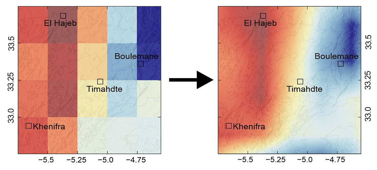
In my most recent published paper, I analysed the effects of incoming solar UV-B radiation on the geochemistry of Atlas cedar pollen, focused on the Middle Atlas Mountains in Morocco. The study area was relatively small, with sample sites fairly close together.
The UV-B data was obtained from the glUV: Global UV-B radiation dataset, which combines data from NASA's Ozone Monitoring Instrument (OMI) onboard the Aura spacecraft, into grid cells containing average erythemally weighted estimates of daily UV-B radiation. You can read full details of the methods used in the associated research paper (Beckmann et al. 2014) (Available open access).
Gridded datasets are an excellent source of data for doing global or macro-scale studies. However, if working in a relatively small area, you may find that your study area is covered by just a few grid cells due to the often low resolution of gridded data. And this can sometimes make it more difficult to carry out analysis.
To overcome the problem, you can interpolate the data to increase the resolution. After interpolation, the gridded data will go from looking like the image on the left, to looking like the image on the right, which is much more detailed for the study area.
Read on to find out how to do this in R!
Climate diagrams are useful tools which provide a visual summary of average climate conditions for a place over a specified period of time. This guide will explain the different parts of a Walter and Lieth climate diagram, and show you how to create one in R using the "climatol" package. This package provides a really quick and easy way to make good-looking Walter and Lieth climate diagrams. But, this guide will also show you how to create one from scratch (no packages needed!).
R has powerful graphical capabilities, and its possible to create almost any kind of graph, chart or plot. It also has powerful annotation options, allowing you to write and draw all over your plot, using labels, shapes, highlighting, and more.
You might have previously created plots in R, and annotated them using a different graphic program (e.g. Photoshop, Corel Draw etc.). But, you could just do it all in R! This guide will show you some of the ways in which you can scribble on your plots, which can be useful for keeping notes, or to highlight certain features of your data...