There is no shortage of ways to do principal components analysis (PCA) in R. Many packages offer functions for calculating and plotting PCA, with additional options not available in the base R installation. R offers two functions for doing PCA: princomp() and prcomp(), while plots can be visualised using the biplot() function. However, the plots produced by biplot() are often hard to read and the function lacks many of the options commonly available for customising plots.
This guide will show you how to do principal components analysis in R using prcomp(), and how to create beautiful looking biplots using R's base functionality, giving you total control over their appearance. I'll also show you how to add 95% confidence ellipses to the biplot using the "ellipse" package.
Guide Information
| Title | Principal Components Analysis (PCA) in R |
| Author | Benjamin Bell |
| Published | February 22, 2018 |
| Last updated | February 27, 2018 |
| R version | 3.4.2 |
| Packages | base; ellipse; factoextra |
| Navigation |
This guide has been updated:
- Updated instructions for adding confidence ellipses to the plot.
- Updated plot code to ensure both axes are the same scale.
This is a 2 part guide:
| Part 1: Principal components analysis (PCA) in R | PCA in R using base functions, and creating beautiful looking biplots. Also covers plotting 95% confidence ellipses. |
| Part 2: Principal components analysis (PCA) in R | PCA in R, looking at loadings plots, convex hulls, specifying/limiting labels and/or variable arrows, and more biplot customisations. |
Principal Components Analysis (PCA) in R
- I've written a new function that makes creating biplots for principal component analysis a breeze, automating the entire process, and allowing full customisation of the plot. Check it out here: Ben's Better Biplot for Principal Component Analysis
Principal components analysis is a statistical technique designed to replace a large set of correlated variables with a reduced set of uncorrelated variables, and it is generally used for exploratory data analysis. For a good overview of PCA and why you might use it, check out the Wikipedia entry.
This guide assumes you already know what PCA is and why you might use it. Part 1 (this guide) covers using prcomp() to do the PCA, and creating beautiful looking biplots using R's base functionality. The second part of this guide covers loadings plots, adding convex hulls to the biplot, and controlling which variable arrows and/or labels are plotted. Check out part 2 here.
There are two functions available in the base installation of R to do PCA, these are princomp() and prcomp(). These functions use different methods to calculate the PCA, and the help page advises that prcomp() has improved numerical accuracy, so is preferable to use this function.
For other ways of calculating and plotting PCA, check out the links in the further reading section at the end of this guide.
PCA using prcomp()
First, we'll need some data to do the principal components analysis on. We'll use the pollen data which I have used in previous guides. To download the data, head to Mendeley Data, and click on the "Morocco Pollen Surface sample Data" .csv file under the "Experiment data files" heading. You don't need to register or sign in, and the data is freely available to download.
Before we do the PCA, we'll tidy up the data by removing unnecessary columns and pollen types with very low abundances.
# Import data
ma.pollen.raw <- read.csv("Morocco Pollen Surface Sample Data.csv", header=TRUE, row.names=1, sep=",", check.names=FALSE)

# Tidy/subset imported data
# Remove the first four columns
ma.pollen <- ma.pollen.raw[-1:-4]
# Remove total AP/NAP and pollen concentration columns
ma.pollen <- ma.pollen[-49:-51]

# Remove columns where total abundanace is less than 10%
ma.sum <- colSums(ma.pollen) # Calculate column sums
ma.pollen1 <- ma.pollen[, which(ma.sum > 10)] # Subset data
For a more detailed explanation of this code, please see part 1 of my guide for creating pollen diagrams.
To perform the PCA, use the following code:
# PCA using base function - prcomp()
p <- prcomp(ma.pollen1, scale=TRUE)
# Summary
s <- summary(p)
Here, the first part of the code creates a "prcomp" object ("p"), which contains the PCA data. scale=TRUE scales the data to unit variance. Take a look at the help page ?prcomp to see all the available arguments. The second part of the code creates an object ("s") containing summary information from the prcomp object. Type "s" into the R console to see:
> s
Importance of components:
                         PC1    PC2
Standard deviation     2.481 1.9331
Proportion of Variance 0.228 0.1384
Cumulative Proportion  0.228 0.3664
The summary will show you standard deviations, the "proportion of variance" i.e. how much variance that principal component accounts for, and the cumulative proportion of variance for all the principal components. I've omitted the full output for this guide.
To understand more clearly how we will generate our PCA biplot, take a look at the "prcomp object" we just created. Type "unclass(p)" into the R console:
> unclass(p)
$sdev

... omitted ...

$rotation

... omitted ...

$center

... omitted ...

$scale

... omitted ...

$x

... omitted ...
(You'll see the full results in the R console)
The "prcomp object" is effectively a list of different matrices containing data generated by the PCA. We are mostly interested in $rotation which is a matrix of the variable loadings, and $x which contains the scores of the observations.
A scree plot can help you to assess how many principal components you want to keep. Use the following code to create scree plots:
# Screeplot
layout(matrix(1:2, ncol=2))
screeplot(p)
screeplot(p, type="lines")

To visualise the PCA using the standard biplot function, use the following code:
biplot(p)
(Pretty simple eh!)
This will result in the following plot. Depending on your data, this plot could look better or worse. biplot() does provide some options to customise the plot (check out ?biplot for all the options), but generally, it will not produce great-looking plots.

As a result, many people choose to use other packages which can create much better looking biplots from principal components analysis. The biplots can usually be created with a single command and multiple arguments using other packages.
But, it is totally possible to create a beautiful biplot using R's base functions. Although this will generally involve more code, it allows you to have complete control over the appearance of the final figure.
So, you might be wondering why not just use another package to create the biplot if its easier? Well, it is not necessarily "easier" if you are already familiar with creating plots, as you'll already know which commands to use and what options are available. You might also be writing your own function or package and do not want to be dependent on other packages for it to work. Or, you might just want to control every aspect of the plot.
At the end of the guide, I'll show you how to create the same plot with the "factoextra" package, so you can compare the code and the biplot, and decide which way you'd prefer to do it.
Creating beautiful biplots using base functions
Creating a beautiful looking biplot using base functionality involves several steps in order to "build" the final figure. I'll go through each step to explain and show you what the code does. Many of these steps are optional, so if you are creating your own PCA plot, you do not have to include all of this code.
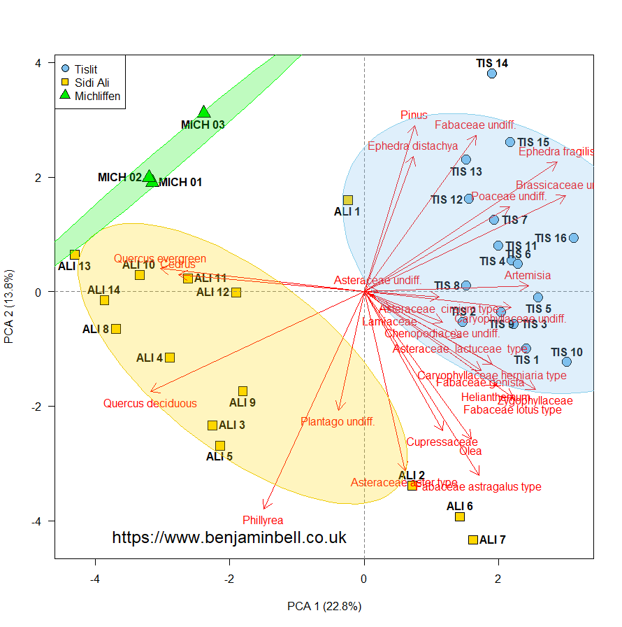
The pollen dataset contains pollen assemblage data for 33 samples, and these come from three locations. We can represent these locations, or groups, on the biplot using different colours and/or different symbols for each group.
We'll do both, so first, we'll specify which colours and symbols to use in our plot:
# Create groups
pch.group <- c(rep(21, times=16), rep(22, times=14), rep(24, times=3))
col.group <- c(rep("skyblue2", times=16), rep("gold", times=14), rep("green2", times=3))
The first part of this code creates a vector containing numbers which represent different symbols. Check out my handy reference guide to pch symbols which you can use to create plots. So, in this example, the first 16 samples (which are the first group) will use the same symbol, the next 14 samples will use a different symbol, and the final 3 samples will use another symbol.
The second part of the code controls the colour of these symbols.

To create the plot, we will start by plotting the individuals (observations) using plot()
# Plot individuals
plot(p$x[,1], p$x[,2], xlab=paste("PCA 1 (", round(s$importance[2]*100, 1), "%)", sep = ""), ylab=paste("PCA 2 (", round(s$importance[5]*100, 1), "%)", sep = ""), pch=pch.group, col="black", bg=col.group, cex=2, las=1, asp=1)
The coordinates for our individuals (observations) are contained within the prcomp object as a matrix: p$x - as we want to plot the first 2 principal components, we use p$x[,1] (PCA 1) and p$x[,2] (PCA 2) to select the relevant data. Typing "p$x[,1:2]" into the R console will show you the data. If you want to plot different principal components, simply change the number in the plot command.
> p$x[,1:2]
               PC1         PC2
TIS 1    2.4116724 -0.99535002
TIS 2    1.4656258 -0.53293058
TIS 3    2.2316417 -0.57131194
TIS 4    2.2025747  0.53652967
TIS 5    2.5897317 -0.10357503
... omitted ...
For the axis labels, we want to include the proportion of variance that the principal component accounts for. This information is contained in the summary object we created earlier. Rather then typing this in manually, we'll extract the information directly from the summary object. To output data from a function as text, you make use of the paste() command.
So, the argument: xlab=paste("PCA 1 (", round(s$importance[2]*100, 1), "%)", sep = "") will result in the following output: "PCA 1 (22.8%)". Any text within the paste() function must be enclosed with quotation marks - functions on the other hand are not enclosed in quotation marks.
The round() function will round the number we extract, in this example, to 1 decimal place.
The variance is extracted from the s$importance matrix - the number in square brackets tells R which cell of the matrix to take the data from. So, for the x axis, we want the variance for the first principal component, and for the y axis we want the variance for the second principal component. Lets take a look at that matrix again:
> s$importance
Importance of components:
                         PC1    PC2
Standard deviation     2.481 1.9331
Proportion of Variance 0.228 0.1384
Cumulative Proportion  0.228 0.3664
The data we want is contained within the second row of the matrix. Remember, by default R will create a matrix in column order, therefore the first column cells will be numbered 1, 2, 3. The second column, 4, 5, 6. So, back to our code, for the x axis label, we want to extract the second cell s$importance[2], and for the y axis label we want to extract the fifth cell s$importance[5] to get the variance data for each principal component.
Since we want to show the variance as a percentage, we also multiply the extracted number by 100 s$importance[2]*100.
sep = "" tells paste() to use whatever is enclosed within the quotation marks as the separator. Since, we do not want to add anything, we leave no space between the quotation marks. For example, if you instead used sep = "_", you would get the following output: "PCA 1 (_22.8_%)".
pch=pch.group tells R to use the symbols (pch) from the "pch.group" object we created earlier when creating the plot. The symbols used in this example are different to other symbols, in that they contain a "filled background". Therefore, the col="black" argument only applies the colour to the border of the plotted symbol. The background colours are changed by using bg=col.group.
cex controls the size of the symbols, and las controls the orientation of the axis labels.
asp=1 ensures that both axes are the same scale.
The resulting plot will look like this:

Next, we'll add gridlines and labels to our plot:
# Add grid lines
abline(v=0, lty=2, col="grey50")
abline(h=0, lty=2, col="grey50")
# Add labels
text(p$x[,1], p$x[,2], labels=row.names(p$x), pos=c(1,3,4,2), font=2)
Here, abline() is used to create a vertical v=0 and horizontal h=0 dashed line lty=2 on the plot. Check out my handy reference guide to line types you can use in R.
text() adds the labels for the individuals (observations) to the plot. You can control the exact position of these labels however you like, in this example pos=c(1, 3, 4, 2) will place each label on a different side of the observations, whose coordinates were specified using p$x[,1], p$x[,2]. Side 1 = bottom, 2 = left, 3 = top, 4 = right.
You could specify the same side for every text label, or you could use a vector to specify a different side for each individual label. By only giving 4 options, its creates a quasi random labelling position, which should help to avoid overlapping labels. But this is not a perfect solution, and you might need to play around with this option for your own data. For PCA biplots that include many hundreds of observations, it may be better to avoid plotting labels altogether.
Now the plot will look like this:

Next, we'll add the variables to the plot as arrows. Because these variables use a different scale to our individuals, if we just plotted them "as is", the arrows could appear quite small, and wouldn't really give us any useful information:

To create "larger" arrows which will more closely match the scale of the individuals, we'll firstly multiply the coordinates of the variables contained within the p$rotation matrix by 10. You can adjust this number to change the size of the arrows for your own plots.
# Get co-ordinates of variables (loadings), and multiply by 10
l.x <- p$rotation[,1]*10
l.y <- p$rotation[,2]*10
Then, to add the arrows to the plot, use:
# Draw arrows
arrows(x0=0, x1=l.x, y0=0, y1=l.y, col="red", length=0.15, lwd=1.5)
The position of the arrows is controlled by x0, x1, y0, y1. To ensure all the arrows are drawn from the centre of the plot, x0 and y0 should have a value of 0. The "ends" of the arrows are specified by x1 and y1 and for our example, we want to use the multiplied coordinates of the variables (loadings). So, we specify the two objects containing the coordinates we just created ("l.x" and "l.y").
The length argument specifies the size of the arrow head, and these values are in "relative" units.
We also want to add labels to the arrows so we know which variables they represent. Like the labels we plotted for the observations, you can position them wherever you like. By default, the labels would be positioned underneath the arrow head - this works fine for the bottom half of the plot, but not for the top half.
We can tell R to plot the labels above the arrows on the top half of the plot with the following code:
# Label position
l.pos <- l.y # Create a vector of y axis coordinates
lo <- which(l.y < 0) # Get the variables on the bottom half of the plot
hi <- which(l.y > 0) # Get variables on the top half
# Replace values in the vector
l.pos <- replace(l.pos, lo, "1")
l.pos <- replace(l.pos, hi, "3")
In this code, we firstly create a new vector object containing the y axis values for the variables (this just copies the vector we created earlier). Then we want to find out which() of the variables (arrows) are plotted on the bottom half of the plot, and which are plotted on the top half of the plot. Those on the bottom will have a negative coordinate value (less than zero), while those on the top will have a positive value (more than zero).
Lastly, we use replace() to replace the values in the "l.pos" object which match the condition set by the "lo" or "hi" objects, with the value in quotation marks. If you type "l.pos" into the R console, you will see the variables and a value of either 1 or 3. We will use this object to specify which side the label is drawn.
So, to add the labels, use the following code:
# Variable labels
text(l.x, l.y, labels=row.names(p$rotation), col="red", pos=l.pos)
Finally, we'll add a legend to the plot:
# Add legend
legend("topleft", legend=c("Tislit", "Sidi Ali", "Michliffen"), col="black", pt.bg=c("skyblue2", "gold", "green2"), pch=c(21, 22, 24), pt.cex=1.5)
Which should result in the following plot:

This gives us a beautiful looking PCA biplot created entirely using R base functions.
Adding 95% confidence ellipses
If you want to add confidence ellipses to your biplot, we can do this using the ellipse() function from the "ellipse" package. Go ahead and install the package using: install.packages("ellipse").
The ellipse is calculated from a correlation matrix of the individuals (observations). So, before we can plot the ellipses, we need to calculate the correlation matrices for each group.
# Get individuals (observations) as a matrix
tab <- matrix(c(p$x[,1], p$x[,2]), ncol=2)
# Calculate correlations
c1 <- cor(tab[1:16,])
c2 <- cor(tab[17:30,])
c3 <- cor(tab[31:33,])
Here, we created a new matrix containing the coordinates of the individuals using the first and second principal components. Then we created separate correlation matrices for each group. Type "c1" into the R console to see the output:
> c1
           [,1]       [,2]
[1,]  1.0000000 -0.3338499
[2,] -0.3338499  1.0000000
The ellipse() function doesn't actually plot the ellipse, it just creates it. So, to add the ellipses to our biplot, we will use the polygon() function.
# Load package
library(ellipse)
# Plot ellipse
polygon(ellipse(c1*(max(abs(p$rotation))*1), centre=colMeans(tab[1:16,]), level=0.95), col=adjustcolor("skyblue2", alpha.f=0.25), border="skyblue")
polygon(ellipse(c2*(max(abs(p$rotation))*1), centre=colMeans(tab[17:30,]), level=0.95), col=adjustcolor("gold", alpha.f=0.25), border="gold2")
polygon(ellipse(c3*(max(abs(p$rotation))*1), centre=colMeans(tab[31:33,]), level=0.95), col=adjustcolor("green2", alpha.f=0.25), border="green")
c1*(max(abs(p$rotation))*1) will firstly, multiply the correlation matrix by the max max() absolute value abs() of the PCA loadings p$rotation. It will then multiply this by 1 (this is because in this example, the PCA axis values are in single digits).
Depending on your own data, you will need to alter this code. If for example, your PCA axis scale is double digits (e.g. -50 to 50), you should change the multiplication value to 100. c1*(max(abs(p$rotation))*100)
If your PCA axis scale is to 1 decimal place (e.g. -0.8 to 0.8), you should divide the correlation matrix by the max absolute value of the loadings, and then multiply by 100. c1/(max(abs(p$rotation))*100)
In this code, we create the ellipse() from the specified correlation matrix e.g. "c1". The centre argument (please note the spelling, "center" will not work), specifies the centre position of the ellipse. This should contain two numbers for the x and y coordinates. As we want to plot the ellipses in the centre of our grouped individual observations, we calculate the means for each principal component, for each group. The mean values become the x and y coordinates. Type "colMeans(tab[1:16,])" into the R console to see the results:
> colMeans(tab[1:16,])
 [1] 2.1254354 0.6628593
The level=0.95 argument sets the confidence level to 95%. You can change this to whatever you like.
adjustcolor() is used to specify the alpha channel (opacity) alpha.f of the specified colour.
This will result in the following plot:
Controlling plot order with panel.first and panel.last
We now have a fairly decent looking biplot (okay, some of the text might be crowded, but that can always be fixed!). Whenever you plot something in R, the order in which you plot the objects is important. Each new object you plot will always be plotted "on top" of the last object. Take a look at the figure above, and notice how the gridlines and ellipses overlap the observation symbols.
To control the order in which the different objects are plotted, you can use the panel.first and panel.last arguments within the plot() function. The commands following these arguments should be on separate lines and enclosed in curly brackets.
So, anything contained within panel.first = { } will be plotted before the main plot. Anything contained within the panel.last = { } will be plotted after the main plot.
We'll now re-plot the biplot - this time in the "correct order". I've also adjusted the margins, the arrow colour, and the x and y axes.
# Plot biplot
par(mar=c(4.5, 4.5, 1, 1))
plot(p$x[,1], p$x[,2], xlim=c(-4.5, 4.5), ylim=c(-4.5, 4.5), xlab=paste("PCA 1 (", round(s$importance[2]*100, 1), "%)", sep = ""), ylab=paste("PCA 2 (", round(s$importance[5]*100, 1), "%)", sep = "", asp=1),
pch=pch.group, col="black", bg=col.group, cex=2.5, cex.axis=1.5, cex.lab=1.5, las=1,
panel.first= {
polygon(ellipse(c1*(max(abs(p$rotation))*1), centre=colMeans(tab[1:16,]), level=0.95), col=adjustcolor("skyblue2", alpha.f=0.25), border="skyblue")
polygon(ellipse(c2*(max(abs(p$rotation))*1), centre=colMeans(tab[17:30,]), level=0.95), col=adjustcolor("gold", alpha.f=0.25), border="gold2")
polygon(ellipse(c3*(max(abs(p$rotation))*1), centre=colMeans(tab[31:33,]), level=0.95), col=adjustcolor("green2", alpha.f=0.25), border="green")
abline(v=0, lty=2, col="grey50")
abline(h=0, lty=2, col="grey50")
},
panel.last=arrows(x0=0, x1=l.x, y0=0, y1=l.y, col="red3", length=0.1, lwd=1.5))
# Labels
text(p$x[,1], p$x[,2], labels=row.names(p$x), pos=c(1,3,4,2), font=2)
text(l.x, l.y, labels=row.names(p$rotation), col="red", pos=l.pos)
# Add legend
legend("topleft", legend=c("Tislit", "Sidi Ali", "Michliffen"), title="Sample Area", inset=c(0.01, 0.01), col="black",
pt.bg=c("skyblue2", "gold", "green2"), pch=c(21, 22, 24), pt.cex=2, cex=1.5, bty="n")
Which results in the following plot:
And that's how you can create a beautiful looking biplot using (almost entirely) base functionality. This approach does involve a little "extra work", but the results are worth it.
Visualising PCA with the "factoextra" package
Now, if you want to avoid all of that code, and just want to create a good looking plot easily, then you could use the "factoextra" package, which will create a PCA biplot using "ggplot2". For full details of the plotting options and a complete tutorial for using this package, check out the links in the further reading section at the end of this guide.
For comparison, here is the code to create a similar PCA biplot using the "factoextra" package (compare with the above code), and the resulting figure:
# Load package
library("factoextra")
# Create groups
group <- c(rep("Tislit", times=16), rep("Sidi Ali", times=14), rep("Michliffen", times=3))
# Plot
fviz_pca_biplot(p, repel=TRUE, pointsize=6, pointshape=21, col.var="red", arrowsize=0.6, labelsize=5, col.ind=group, palette=c("green2", "gold", "skyblue2"), addEllipses=TRUE, ellipse.type="confidence")

Ultimately, its down to personal preference as to how you create your biplots. Hopefully, this guide has shown you that its perfectly possible to create great looking plots using R's base functions.
As ever, thanks for reading this guide, and don't forget to check out part 2 of this guide, which covers loadings plots, convex hulls, and more customisations! Please leave any comments or questions below.
This is a 2 part guide:
| Part 1: Principal components analysis (PCA) in R | PCA in R using base functions, and creating beautiful looking biplots. Also covers plotting 95% confidence ellipses. |
| Part 2: Principal components analysis (PCA) in R | PCA in R, looking at loadings plots, convex hulls, specifying/limiting labels and/or variable arrows, and more biplot customisations. |
Further reading
Principal components analysis (PCA) - Part 2 - The second part of this guide for PCA, that covers loadings plots, convex hulls, specifying/limiting labels and/or variable arrows, and more biplot customisations.
A quick guide to pch symbols - A quick guide to the different pch symbols which are available in R, and how to use them. [R Graphics]
A quick guide to line types (lty) - A quick guide to the different line types available in R, and how to use them. [R Graphics]
PCA - Principal Component Analysis Essentials - This excellent guide to principal components analysis details how to use the "FactoMineR" and "factoextra" packages to create great looking PCA plots.
5 functions to do Principal Components Analysis in R - This blog post shows you some different functions to perform PCA.
Quick-R PCA - This quick guide shows you different options for PCA analysis in R.
Nice post; thanks for writing it. A couple of comments:
ReplyDeletei) I don't see it in your code, but it is really important with biplots that you use the same scales on both axes. With base graphics this means you need to `asp = 1` in your plot call.
ii) the biplots you show are using the raw scaling of the scores, which is typically not something we use with species-based ordinations. As you saw, you need to somewhat arbitrarily scale the arrows here to see what's going on. There are well-justified scalings that can be applied to one of the species (variables) or sites (samples) scores, or both, depending on what aspects of the ordination you are trying to emphasise; is it a plot to best represent the Euclidean distances between samples or a plot that best preserves the correlations/covariances between species (variables)?
These scalings are the ones typically used in software such as Canoco or, in R, the vegan pkg. vegan also has options for adding hulls and ellipses, etc. which would make the manipulations required to plot easier to produce, leaving you to concentrate on the aesthetic aspects. There's also a ggvegan pkg on github which is making progress on providing ggplot2-based versions of the plots in vegan.
Thanks for your comments Gavin!
Delete1) Yep - you are absolutely correct, this was missing from my example code, so I have updated the guide to include this.
2) The R base function for PCA is somewhat limited - and I agree that the "vegan" package is the best choice for ordination analysis, especially for species/environmental stuff.
The purpose of this guide was more to show the graphical capabilities of R using base functionality - perhaps pollen was not the best example to showcase this :)
Look forward to the "ggvegan" package - perhaps a future blog post could compare this with base functions.
Best wishes
dear sir i have the biological replicate data, how can i convert replicates into a group in R. pls mention the command. I want to make PCA. pls help me.
ReplyDeleteHi Silambu,
DeleteI'm not 100% sure what you mean - do you want to show each replicate on the PCA? And show them as a group by using the colour and/or symbol?
If so, take a look at the section "Creating beautiful biplots using base functions" as it shows you how to create groups. Essentially, your own data should be ordered in a way where the data points for the same group are together. For example, if you have 5 samples, with 3 replicates each, they should be arranged in a matrix/data frame like this:
1A
1B
1C
2A
2B
... etc.
You could then create your groups as follows:
pch.group <- c(rep(1, times=3), rep(2, times=3), rep(3, times=3), rep(4, times=3), rep(5, times=3))
This code would create 5 groups of 3 (5 samples, 3 replicates). The number after "rep(" is the pch symbol.
Or, do you want to take an average of the replicates and only show those on the PCA?
If this is the case, again using the above example (5 samples, 3 replicates), you can average the data for your replicates by using colMeans() - assuming each replicate data is in rows.
Lets say your data frame is called "df", you could use the following code:
df1 <- colMeans(df[1:3,]) # Sample 1
df2 <- colMeans(df[4:6,]) # Sample 2
... etc.
And then, combine all the averaged data into a new df
new.df <- rbind(df1, df2, df3, df4, df5)
Hopefully this helps! - If you are getting stuck using your own data, please go through the guide using the "pollen data", which takes you through step by step. This should then help you when it comes to trying out your own data.
Best wishes,
Ben
Hello. Great job! You could make the data available:"Morocco Pollen Surface Sample Data.csv?
ReplyDeleteHi Samuel, glad you like the guide. The data is available, and is detailed in the “PCA using prcomp()” section on how to get it. Alternatively use the following link:
Deletehttps://data.mendeley.com/datasets/48ygt7bx7f/2
Best wishes,
Ben
Hi Ben, nice work! I have a question about the addition of 95% confidence ellipses. Here, you use the c1*(max(abs(p$rotation))*1 for the correlation maxtrix scaling. But the coefficient (i.e. 1) may be very subjective. So, I wonder to know whether it have unified method/principle to decide this coefficient?
ReplyDeleteThanks,
Zhiwei
Hi Zhiwei,
DeleteYou're right, here it is subjective, the purpose purely to make a nice looking plot. Might be worth taking a look at some of the dedicated packages for PCA, which will have better control over this, e.g. vegan has some nice PCA stuff!
Best wishes,
Ben
Hi Ben,
ReplyDeleteIt is really usufull. One of the best descriptions.
Br, Maxim Zaitsev
Hi Ben,
ReplyDeleteReally usefull. Thanks!
Br,
Maxim
Hi Ben,
ReplyDeleteThis is a really useful guide especially for someone like myself who is only just getting into R and using it for analysis of my pollen data. I have Written a script based on your own (which I will be sure to credit you with) but wanted to know if it is possible to plot my species as points rather than the arrows?
Thanks
Nick
Hi Nick,
DeleteYes of course - instead of using the arrows() function, use the points() function instead. For example:
points(x=l.x, y=l.y, col="red")
You can of course customise these further, check out the help page: ?points
Best wishes,
Ben
Excellent explanation. Thanks for sharing your knowledge.
ReplyDeleteIn addition, I like the idea to mine the furthest the base function without adding so many packages.
DeleteBest!
High Ben, my name is Seba, only one question, how can I get the coordinates for the arrows, i.e., i want to show them in the right and upper axis... Thanks!
ReplyDeleteHi Seba,
DeleteApologies for the delay in my reply - the coordinates for the arrows are contained in the "l.x" and "l.y" objects created in this guide.
To display the axis on all sides, you can use the axis() function. e.g. axis(3) and axis(4) would plot a basic axis on the top and right hand side of the biplot respectively.
Best wishes,
Ben
I'm seba again. Just to thank you for your answer and congratulate you for your clear explanation using base function!! This is very important because you know what you're doing!!
DeleteVery best!
Hi Ben, thank you for this detailed guide.
ReplyDeleteI tried to load my data into R, but I keep getting this error: Error in colMeans(x, na.rm = TRUE) : 'x' must be numeric
I think it is due to the fact that my second and third columns are "categorical variables" which consists of 4 different "STATE" and 3 different "SPECIES". How do I retain these two factors while running PCA? They are important for interpretation of my PCA results, so I cannot omit then.
Thank you.
Yours Sincerely,
Tan Chee Ping.
Hi Tan Chee Ping.
DeleteThe colMeans is throwing up the error because it will only work with numeric data.
My suggestion would be to create a new data.frame/matrix containing only the numeric data in order to run colMeans (i.e. subset the numeric data you want to average to a new object) - and then recombine this data with your factors to use with the pca.
If you need help with subsetting - please send me an email (See contact page) with your dataset, and i can take a better look for you.
Best wishes,
Ben
Hi Ben, many thanks for your perfect descriptions. I wish the best for you.
ReplyDeleteHi Ben,
ReplyDeleteI am learning about PCA. I have a data set of bacterial species abundant in 4 samples, I want to know how different is among the 4 samples by bacterial composition. I wonder if I could set my samples as variables, and bacterial species as scores?
For example:
Sample A B C D
(number of indivudual)
Bacterium 1 100 300 500 200
B2 300 400 100 300
. . . . .
. . . . .
B1000 100 50 200 100
From your data set, in my understanding, you put species as variables (columns) and site samples (rows) as scores for PCA. Is it posible of switching species as scores, and site samples as variables?
Thank you.
I guess it depends on what you are trying to understand from your dataset, but really, the variability is within the species, the sample numbers are just arbitrary values assigned to them.
DeleteE.g. group 1, group 2, group 3 ... You want to understand the variability of the different groups, so you look at whats in those groups.
PCA is really about trying to reduce complex datasets to try and interpret them, while keeping the variability. PCA effectively creates new variables (the principle components) from the variables that you give it. PCA should be considered as a descriptive technique. There is a really great review of PCA which explains the technique, which might help understand how it should be used:
https://royalsocietypublishing.org/doi/10.1098/rsta.2015.0202
Else, hopefully someone more knowledgeable than me on the subject can give a better answer :)
I'm trying to create a biplot of PCA including variables and individuals in factoextra package as below.
ReplyDeletefviz_pca_biplot(res.pca, label = "var", xlab = "PC1 (81.6%)", ylab = "PC2 (6.9%)",
fill.ind= group, palette = c("#2E9FDF","green","red","yellow","violet","dark orange"), pointsize = 5, mean.point = F, pointshape = c(20,20,20,15,15,15,16,16,16,17,17,17,18,18,18,19,19,19),
addEllipses = F, repel = T,
col.var = "contrib", gradient.cols = c("light grey", "purple", "red"), arrowsize = 0.7,
legend.title = list(color = "% Gene contribution", fill = "Modality")
)
When I try to change the point shape and the color of the symbols of individuals, R can't generate a proper legend because
In if (shape %in% colnames(data)) { :
the condition has length > 1 and only the first element will be used
I saw that I need to vectorize an element but I don't know. Please help.
Thank you in advance.
Hi Ben
ReplyDeleteI love your PCA lesson. It is super useful. I got through the entire pollen example and now I am trying to plot my own data. It is a PCA for gene expression (31 samples and 39,000 variables), I got a plot with this code (adjusted code by you)
load("logfpkmdata.RData")
pca <- prcomp(t(logfpkm),scale=FALSE)
s <- summary(pca)
pch.group <- c(rep(21,times=6),rep(23,times=10),rep(22, times=9),rep(24,times=6))
col.group <- c(rep("skyblue2", times=6), rep("gold", times=10), rep("red", times=9), rep("green", times=6))
plot(pca$x[,1], pca$x[,2], xlab=paste("PCA 1 (", round(s$importance[2]*100, 1), "%)", sep = ""), ylab=paste("PCA 2 (", round(s$importance[5]*100, 1), "%)", sep = ""), pch=pch.group, col="black", bg=col.group, cex=2, las=1, asp=1)
legend("topleft", legend=c("EMLR", "MACN", "STAR", "MACS"), col="black", pt.bg=c("skyblue2", "gold", "red", "green"), pch=c(21, 23, 22, 24), pt.cex=1.5)
tab <- matrix(c(pca$x[,1], pca$x[,2]), ncol=2)
c1 <- cor(tab[1:6,])
c2 <- cor(tab[7:16,])
c3 <- cor(tab[17:25,])
c4 <- cor(tab[26:31,])
library(ellipse)
polygon(ellipse(c1*(max(abs(pca$rotation))*1500), centre=colMeans(tab[1:6,]), level=0.95), col=adjustcolor("skyblue", alpha.f=0.25), border="skyblue")
polygon(ellipse(c3*(max(abs(pca$rotation))*5400), centre=colMeans(tab[17:25,]), level=0.95), col=adjustcolor("red", alpha.f=0.25), border="red")
polygon(ellipse(c4*(max(abs(pca$rotation))*1500), centre=colMeans(tab[26:31,]), level=0.95), col=adjustcolor("green", alpha.f=0.25), border="green")
polygon(ellipse(c2*(max(abs(pca$rotation))*6400), centre=colMeans(tab[7:16,]), level=0.95), col=adjustcolor("gold", alpha.f=0.25), border="gold")
I also created a PCA plot with a different package
samples <- read.table("samples.txt",header=TRUE)
install.packages('ggfortify')
library(ggfortify)
autoplot(pca, data = samples, colour = 'location')
pallete = c("#1D91C0","#993404","#FEC44F","#016C59")
autoplot(pca,data = samples,colour = 'location',frame = TRUE, frame.type = 'norm',frame.colour = 'location', facets = FALSE, size = 3)+ scale_colour_manual(values=pallete)
My question in that the ellipses in the two different graphs are different shape.
Would you be able tell me why?
Please help if you can Thanks so much
Hi,
DeleteWithout seeing the output it’s hard to know the answer, but the ellipsis you create with this guide can be a bit subjective, whilst the package you are using probably uses a standard and consistent approach resulting in a different appearance compared with doing it manually. Also, sometimes I have the found the ellipsis plots “in the wrong direction”, so I probably need to revisit this and update the guide.
Sorry that’s not a very helpful answer!
Ben
This is a great blog. Thanks Benjamin.
ReplyDeleteImpressive blog!
ReplyDeleteThank you so much.
ReplyDelete