Part 2 of the guide for making bathymetric maps in R. This part focuses on creating effective colour schemes using break points to control the colour.
Guide Information
| Title | Bathymetric maps in R: Colour palettes and break points |
| Author | Benjamin Bell |
| Published | August 22, 2019 |
| Last updated | |
| R version | 3.6.1 |
| Packages | base; raster; ncdf4 |
| Navigation |
This is a 2 part guide:
| Part 1: Getting and plotting data | How to create bathymetric maps in R using freely available data from online sources. |
| Part 2: Colour palettes and break points | How to create effective colour schemes using break points, which is useful for when plotting bathymetric maps. |
Colour palettes
This is part 2 of my guide for creating bathymetric maps in R. You should have read part 1 to follow this guide if you are creating bathymetric maps. However, you do not need to read part 1 if you only want to understand the use of break points for controlling colour on raster and/or image plots.
So far, in part 1 of this guide, I have shown you several bathymetric maps with sensible looking colour schemes/palettes, but, how do you create them?. If you plotted the ETOPO1 data using the default plot() options (as explained in part 1), you would have ended up with a map that looks like this:
plot(etopo.i))
Which looks awful! You could try using topo.colors() instead:
plot(etopo.i, col=topo.colors(100))
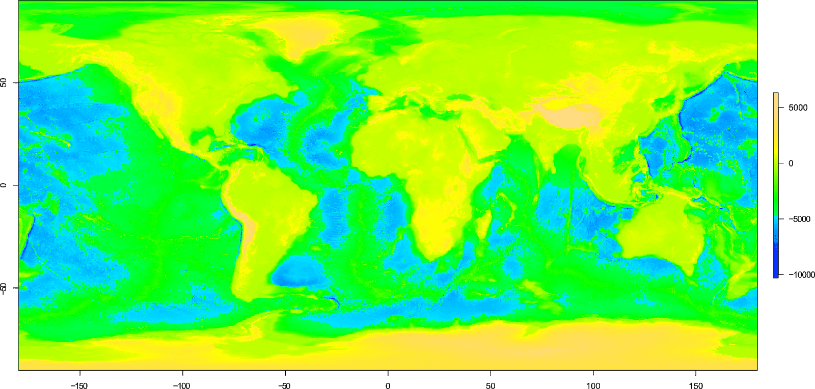
This still looks pretty bad, although the scheme at least includes the colour blue to indicate areas of water.
The problem with defaults
As you can see, using the default plot() options, even when using a colour scheme designed to indicate water, can give unexpected (i.e bad!) results.
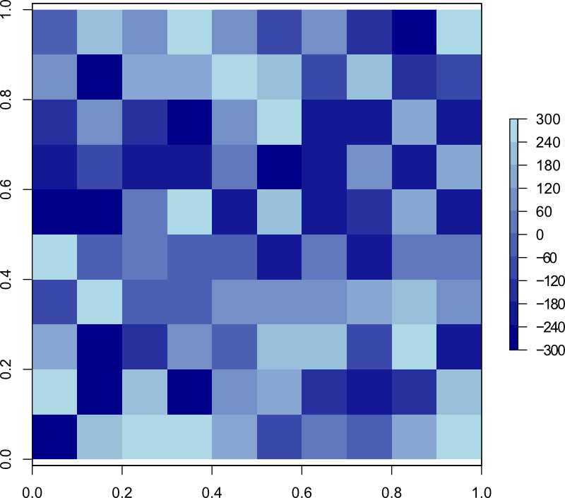
To explain the problem, I'll use a simple example with a raster containing random data with values between -300 and 300 to represent elevation. We'll plot the raster using the topo.colors() scheme.
# Create a raster using random data
d <- matrix(round(runif(100, min=-300, max=300)), ncol=10)
simple <- raster(d)
# Plot using topo.colors() scheme
plot(simple, col=topo.colors(10))
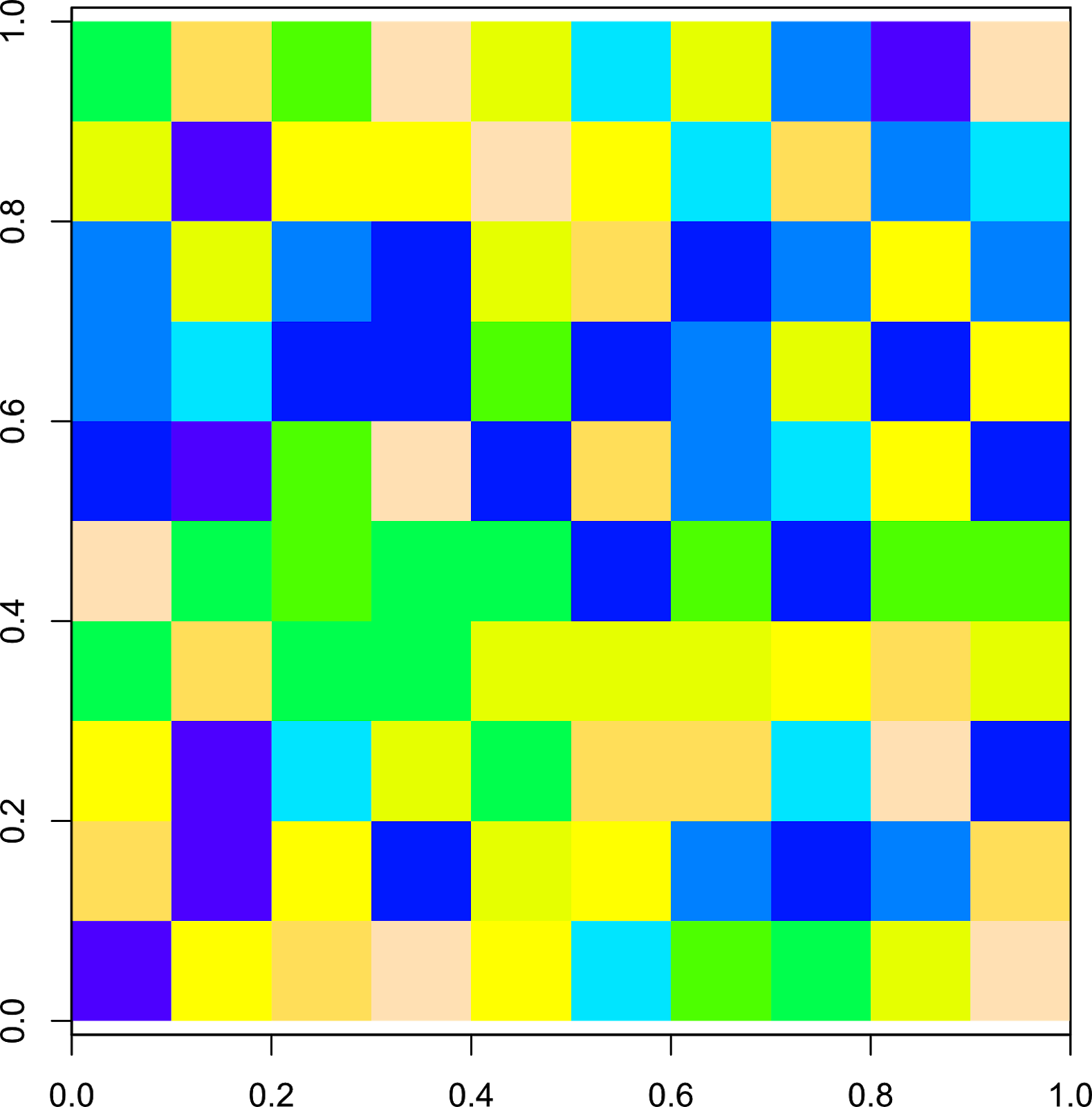
For the raster we have just created, we want the values below 0 to represent water and ideally these should be a shade of blue, while values above 0 should represent land, and these should be a shade of green or yellow (or t'other terrain-like colours). In this example, 0 or mean sea level, falls exactly half way between our minimum and maximum values.
We told R to create 10 colours using the topo.colors() function, which you can see in the R console:
> topo.colors(10)
 [1] "#4C00FFFF" "#0019FFFF" "#0080FFFF" "#00E5FFFF" "#00FF4DFF" "#4DFF00FF" "#E6FF00FF" "#FFFF00FF" "#FFDE59FF" "#FFE0B3FF"
If we look at the scale in detail, we can see that a third of colours are shades of blue, a third with shades of green and a third with shades of yellow.
So, they do not "line up" with our scale.
Break points
The heart of the problem with using the defaults, is related to break points. A break point is the point in the scale where one colour changes to the next.
By default, for raster plots R creates equally spaced break points for your scale bar. In our example, we just so happen to have the same number of break points as we have colours.
But, the topo.colors() function only creates 33% of colours as shades of blue (representing water), while 50% of the break points in our example represent water.
Herein lies the problem! Not enough shades of blue are created by the topo.colors() function to match the scale of our raster, or the number of break points we have.
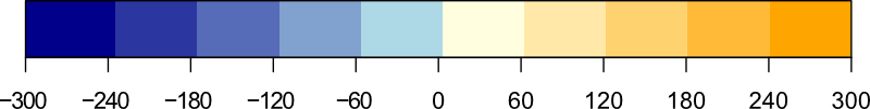
To avoid problems with the colour scheme, it is necessary to specify the number of break points that R should use. This should match the number of colours you intend to use plus 1, e.g. if you use 10 colours, you should have 11 break points.
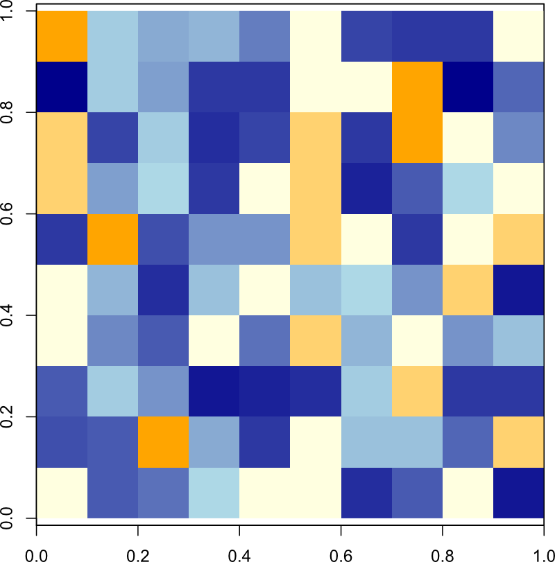
Now, this can get complicated when using the topo.colors() function, so instead, lets use a custom colour scheme, and we'll define exactly where we want the break points to be:
# Colour scheme
blue.col <- colorRampPalette(c("darkblue", "lightblue"))
yellow.col <- colorRampPalette(c("lightyellow", "orange"))
# Break points
br <- seq(from=-300, to=300, by=60)
# Plot
plot(simple, col=c(blue.col(5), yellow.col(5)), breaks=br)
Here, we created two separate colour palettes which will create our colour scheme. As a minimum, you need to specify a "start" colour, and a "final" colour to create a colour ramp, as R will interpolate the colours in between. You can of course create color ramps specifying as many colours as you wish. I previously looked at using colour ramps in my guide: creating simple location maps.
Let's take a look at the two colour ramps:
> blue.col(5)
[1] "#00008B" "#2B36A1" "#566CB8" "#81A2CF" "#ADD8E6"
> yellow.col(5)
[1] "#FFFFE0" "#FFE8A8" "#FFD270" "#FFBB38" "#FFA500"
We use the combine c() function to combine our two colour palettes for the col argument.
The break points are created using a sequence seq(), which can be seen in the R console:
> br
 [1] -300 -240 -180 -120  -60    0   60  120  180  240  300
And the resulting plot:

Now the scale matches what we intend, where values below 0 are a shade of blue, and values above 0 are in this case, a shade of yellow.
As previously mentioned, the number of colours you use should be 1 less than the number of break points you have. But what happens if you specify more colours than you have break points? Lets find out, we'll plot the raster again, but this time we'll use the following code:
 # Plot
plot(simple, col=c(blue.col(10), yellow.col(10)), breaks=br)
In this example, we told R to create 20 colours with 10 shades of blue, and 10 shades of yellow. Since we only have 11 break points, only the first 10 colours are plotted (the blue colours), and the yellow colours do not get a chance to appear. Our scale is no longer representative of land and water, so this highlights the importance of getting your numbers right!
When creating your own colour schemes, you can use any number of break points you wish, and these do not have to be evenly spaced.
Let's create another simple raster, but using values from -1000 to 500.
# Create a raster using random data
d <- matrix(round(runif(100, min=-1000, max=500)), ncol=10)
simple <- raster(d)
For the break points, we will create an uneven sequence:
# Break points
br <- c(seq(from=-1000, to=0, by=50), seq(from=200, to=600, by=200))
> br
 [1] -1000  -950  -900  -850  -800  -750  -700  -650  -600  -550  -500
[12]  -450  -400  -350  -300  -250  -200  -150  -100   -50     0   200
[23]   400   600
We can confirm the number of break points by using the length() function:
> length(br)
[1] 24
So, we need to create a colour scheme with 23 colours. We'll use the same colour palettes as before, but to match the new break points, we'll plot 20 shades of blue and only 3 shades of yellow:
# Plot
plot(simple, col=c(blue.col(20), yellow.col(3)), breaks=br)

And as you can see, we have the desired result with values below 0 being a shade of blue, and colours above being a shade of yellow.
Now we understand how this works, we can apply it to our bathymetric data.
Creating a colour scheme for bathymetric data
To create the colour scheme for our bathymetric datasets we first need to know the minimum and maximum values for the raster data.
For this example, we'll use the ETOPO1 Ice surface bathymetry data. This code assumes you have already downloaded and imported the data in to R, as shown in part 1 of this guide.
# Load packages
library(raster)
# Import data ### See part 1 of this guide ###
etopo.i <- raster("ETOPO1_Ice_g_geotiff.tif")
# Calculate min and max values
mi <- cellStats(etopo.i, stat="min")-100
ma <- cellStats(etopo.i, stat="max")+100
Here we use the cellStats() function from the raster package to calculate the stat we want (min and max). Due to rounding issues, we'll decrease the minimum value by -100, and increase the max value by 100 (the reason for this will become evident in subsequent sections).
When dealing with large raster files, calculating the min and max values can take a long time (this is particularly evident with the GEBCO_2019 data).
You can see the results in the R console:
> mi
[1] -10998
> ma
[1] 8371
Okay, so now that we know the min and max elevation for our bathymetric data, we can use this information to create our break points.
We'll create two sequences of evenly spaced break points. The first from our minimum elevation to 0 (mean sea level), and the second from 0 to our max elevation. These will represent water and land.
Why do we create two separate sequences? Because in our data, the elevation below and above mean sea level is not equal.
# Break points sequence for below sea level
s1 <- seq(from=mi, to=0, by=0 - mi / 50)
# Break points sequence for above sea level
s2 <- seq(from=0, to=ma, by=ma / 50)
In order to create evenly spaced break points, we take the minimum value (which is -10998), and divide this by 50. We do the same for the maximum value (8371). The number you divide these by can be anything you like, depending on how many break points you want. Let's take a look at the first sequence in R:
> s1
 [1] -10998.00 -10778.04 -10558.08 -10338.12 -10118.16  -9898.20
 [7]  -9678.24  -9458.28  -9238.32  -9018.36  -8798.40  -8578.44
[13]  -8358.48  -8138.52  -7918.56  -7698.60  -7478.64  -7258.68
[19]  -7038.72  -6818.76  -6598.80  -6378.84  -6158.88  -5938.92
[25]  -5718.96  -5499.00  -5279.04  -5059.08  -4839.12  -4619.16
[31]  -4399.20  -4179.24  -3959.28  -3739.32  -3519.36  -3299.40
[37]  -3079.44  -2859.48  -2639.52  -2419.56  -2199.60  -1979.64
[43]  -1759.68  -1539.72  -1319.76  -1099.80   -879.84   -659.88
[49]   -439.92   -219.96      0.00
Now this looks pretty messy. We'll use the round() function to tidy it up.
For first sequence, we need to round down to the nearest 100, and for the second sequence, we need to round up to the nearest 100. However, the round function will always round to the nearest 100, which may be up or down. This could create problems with our colour scale (depending on the data), so an easy work around is to decrease and increase the min (mi) and max (ma) values respectively, of the raster data, which we have already done (in the earlier code).
# Round sequence to nearest 100
s1 <- round(s1, -2)
s2 <- round(s2, -2)
We'll also use the unique() function to remove any duplicate numbers from our two sequences (if any), as break points can not contain the same number twice.
# Only show unique numbers
s1 <- unique(s1)
s2 <- unique(s2)
The two sequences should now look like this:
> s1
 [1] -11000 -10800 -10600 -10300 -10100  -9900  -9700  -9500  -9200
[10]  -9000  -8800  -8600  -8400  -8100  -7900  -7700  -7500  -7300
[19]  -7000  -6800  -6600  -6400  -6200  -5900  -5700  -5500  -5300
[28]  -5100  -4800  -4600  -4400  -4200  -4000  -3700  -3500  -3300
[37]  -3100  -2900  -2600  -2400  -2200  -2000  -1800  -1500  -1300
[46]  -1100   -900   -700   -400   -200      0
> s2
 [1]    0  200  300  500  700  800 1000 1200 1300 1500 1700 1800 2000
[14] 2200 2300 2500 2700 2800 3000 3200 3300 3500 3700 3900 4000 4200
[27] 4400 4500 4700 4900 5000 5200 5400 5500 5700 5900 6000 6200 6400
[40] 6500 6700 6900 7000 7200 7400 7500 7700 7900 8000 8200 8400
Now we have 2 unique sequences which we will combine to create our break points. But, since both sequences contain "0", we'll remove one of these when we combine:
# Combine sequences and remove the first value from second sequence
s3 <- c(s1, s2[-1])
Before we use these break points, we should confirm the number of break points we actually have. Since we divided the min and max values by 50, we should have at least 50 break points. However, this is not always the case, as the number of break points created depends on the min and max values, the rounding, and the unique numbers (more on this in the next section).
> length(s1)
[1] 51
> length(s2)
[1] 51
> length(s3)
[1] 101
Our two sequences have 51 break points, but the combined sequence has 101 break points (since we removed a 0 value from the second sequence when combining).
So, for the first part of our colour scheme, we should create 50 shades of blue to represent water. Why do we not create 51 since there are 51 break points? Lets take a look at the scale from an earlier example again:
There are 6 break points from -300 to 0 (including 0). But, only 5 shades of blue. The colour appears "to the right" of the break point, so -300 to -240 is one shade of blue, -240 to -180 another shade of blue and so on. If we were to use the same number of colours as break points, 0 to 60 would also be a shade of blue, hence why we use 1 less colour than we have break points.
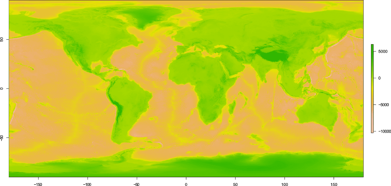
For the second part of the colour scheme to represent land, we'll use the terrain.colors() function. The second sequence we created also has 51 break points, but we removed the duplicate 0 value when we combined the sequences, so we should create 50 colours to represent our land.
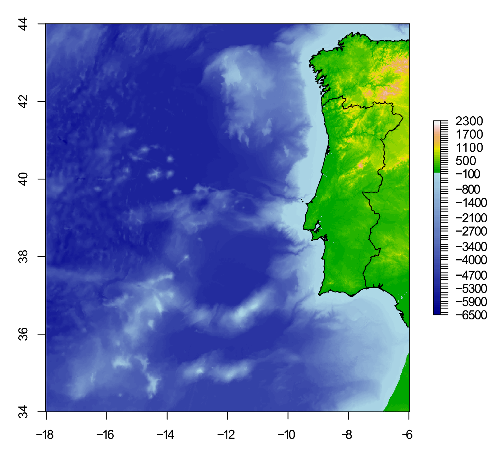
To create the plot in R, use the following code:
# Plot
plot(etopo.i, col=c(blue.col(50), terrain.colors(50)), breaks=s3)

Our scale does look a little messy - but this can be fixed (an upcoming guide will show you how to do this in R).
Important! The break points you create are based on the bathymetric data (or whatever you are plotting) that you are currently using. If you change the data source, for example, you plot a crop of your data, you must create new break points and alter the colour scheme accordingly. If you do not, your break points and colour scheme will no longer scale correctly.
Since redoing all of that code each time you want to create a new plot or change the colour scheme would be tedious, the next section shows you how to do this in a function.
Automatic break points using a function
You can easily automate the process of creating break points for different plots by using a function.
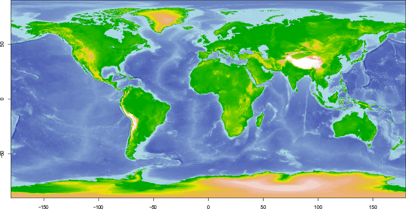
For this example, we'll use the GEBCO_2019 data (from part 1), and create a map of the coast of Portugal.
# Load packages
library(raster)
library(ncdf4)
# Import data ### See part 1 of this guide ###
gebco <- raster("GEBCO_2019.nc")
# Create extent (our map area)
pr.e <- extent(-18, -6, 34, 44)
# Create a crop of the bathymetric data
pr.gebco <- crop(gebco, pr.e)
So, to manually create the colour scheme for this crop, we would have to repeat all the steps in the previous section, changing the variables for each step.
Instead, lets rewrite the code as a function:
# Function to calculate colour break points
# x = raster, b1 & b2 = number of divisions for each sequence, r1 & r2 = rounding value
colbr <- function(x, b1=50, b2=50, r1=-2, r2=-2) {
     # Min/max values of the raster (x)
	mi <- cellStats(x, stat="min")-100
	ma <- cellStats(x, stat="max")+100
	# Create sequences, but only use unique numbers
	s1 <- unique(round(seq(mi, 0, 0-mi/b1),r1))
	s2 <- unique(round(seq(0, ma, ma/b2),r2))
     # Combine sequence for our break points, removing duplicate 0
	s3 <- c(s1, s2[-1])
	# Create a list with the outputs
     # [[1]] = length of the first sequence minus 1 (water)
     # [[2]] = length of the second sequence minus 1 (land)
     # [[3]] = The break points
	x <- list(length(s1)-1, length(s2)-1, s3)
}
I've added lots of comments to the above code so the function is easy to understand (you do not need these if copying the code). It uses the same code we used in the previous section, only this time the code is written in a way that it can be reused without having to rewrite it each time. Refer to the previous section for a fuller explanation of each step.
We'll use the function on our cropped GEBCO_2019 data with the default options:
# Use function with default options
pr.br <- colbr(pr.gebco)
And if we now type "pr.br" into the R console, the function will output a list of data:
> pr.br
[[1]]
[1] 50

[[2]]
[1] 23

[[3]]
 [1] -6500 -6400 -6200 -6100 -6000 -5900 -5700 -5600 -5500 -5300 -5200
[12] -5100 -4900 -4800 -4700 -4600 -4400 -4300 -4200 -4000 -3900 -3800
[23] -3600 -3500 -3400 -3300 -3100 -3000 -2900 -2700 -2600 -2500 -2300
[34] -2200 -2100 -2000 -1800 -1700 -1600 -1400 -1300 -1200 -1000  -900
[45]  -800  -700  -500  -400  -300  -100     0   100   200   300   400
[56]   500   600   700   800   900  1000  1100  1200  1300  1400  1500
[67]  1600  1700  1800  1900  2000  2100  2200  2300
The first item in our list is the number of colours we should use to represent water. The second item is the number of colours to use to represent land, and the third item is the break points. Remember, these are specific to the raster (i.e. the crop of GEBCO_2019) that we are using in this example.
In the above example we used the default options specified by the function to create our break points. This should have resulted in 101 break points with the water and land each using 50 colours. But, you'll notice that the function only created 74 break points, and tells us that we should use 50 water colours and 23 land colours.
The reason for the discrepancy is due to the scale of our cropped raster, and the rounding options specified by the function. (I touched on this in the previous section).
To understand, lets take a look at the min and max values for our crop:
> cellStats(pr.gebco, stat="min")-100
[1] -6502.328
> cellStats(pr.gebco, stat="max")+100
[1] 2250.488
Now what happens if we were to manually create the second sequence using code from the previous section:
s2 <- seq(from=0, to=2250.488, by=2250.488 / 50)
s2 <- round(s2, -2)
If you take a look at this sequence, we'll see there are many duplicate values (since they are rounded to the nearest 100):
> s2
 [1]  0    0  100  100  200  200  300  300  400  400  500  500  500
[14]  600  600  700  700  800  800  900  900  900 1000 1000 1100 1100
[27] 1200 1200 1300 1300 1400 1400 1400 1500 1500 1600 1600 1700 1700
[40] 1800 1800 1800 1900 1900 2000 2000 2100 2100 2200 2200 2300
Since we must remove the duplicates to create the break points, this is why we end up with less break points (and thus less colours) than specified to represent the land.
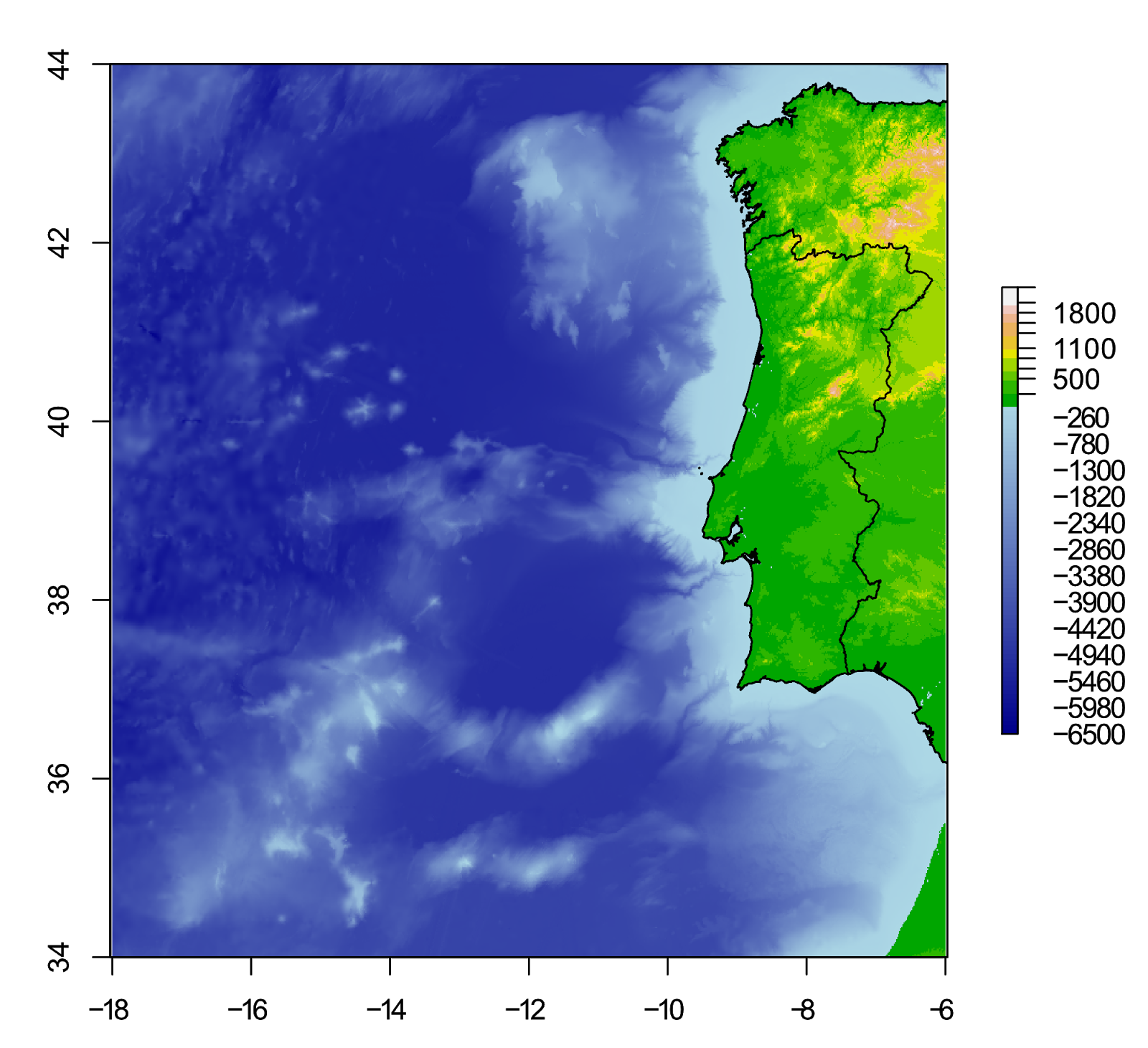
Let's plot this up to see the result. We'll also add country shapefiles to make it look better:
# Get country shapefiles
pr <- getData("GADM", country="PRT", level=0)
esp <- getData("GADM", country="ESP", level=0)
# Colour palette
blue.col <- colorRampPalette(c("darkblue", "lightblue"))
# Plot GEBCO_2019 coast of Portugal
plot(pr.gebco, col=c(blue.col(pr.br[[1]]), terrain.colors(pr.br[[2]])), breaks=pr.br[[3]])
plot(pr, add=TRUE)
plot(esp, add=TRUE)
You'll see from the above code that I did not explicitly state the number of colours to create for either the water or land colour schemes, nor did I state the number of break points.
Instead, these values are pulled directly from the list which our function created. This allows us to change the options in the function (creating new values), without having to rewrite our plot code. It also ensures that the colour scheme is created correctly.
Lets change some of the options for our function, which will alter the colour scheme:
# Auto break points
pr.br <- colbr(pr.gebco, b1=1000, b2=10, r1=-1, r2=-2)
In this example, we are attempting to create 1000 break points for the colour scale which will represent water b1=1000, and only 10 break points for the land b2=10, for a total of 1010. And this time, we will round our break point values to the nearest 10 for the water r1=-1, but keep land to the nearest 100 r2=-2.
If you look at this in the R console, the function has actually created 661 break points, where the water should be represented by 650 shades of blue (or whatever colour scheme you want to use), and 10 shades of land colours terrain.colors().
We can replot our map using the same code as before. We do not need to change any values for the number of colours, since these are pulled directly from the object created with our function.
# Plot GEBCO_2019 coast of Portugal
plot(pr.gebco, col=c(blue.col(pr.br[[1]]), terrain.colors(pr.br[[2]])), breaks=pr.br[[3]])
plot(pr, add=TRUE)
plot(esp, add=TRUE)
At this resolution, there is not much difference in the plots. The water scale is definitely smoother, while the land scale is coarser, but it is generally not that noticeable.
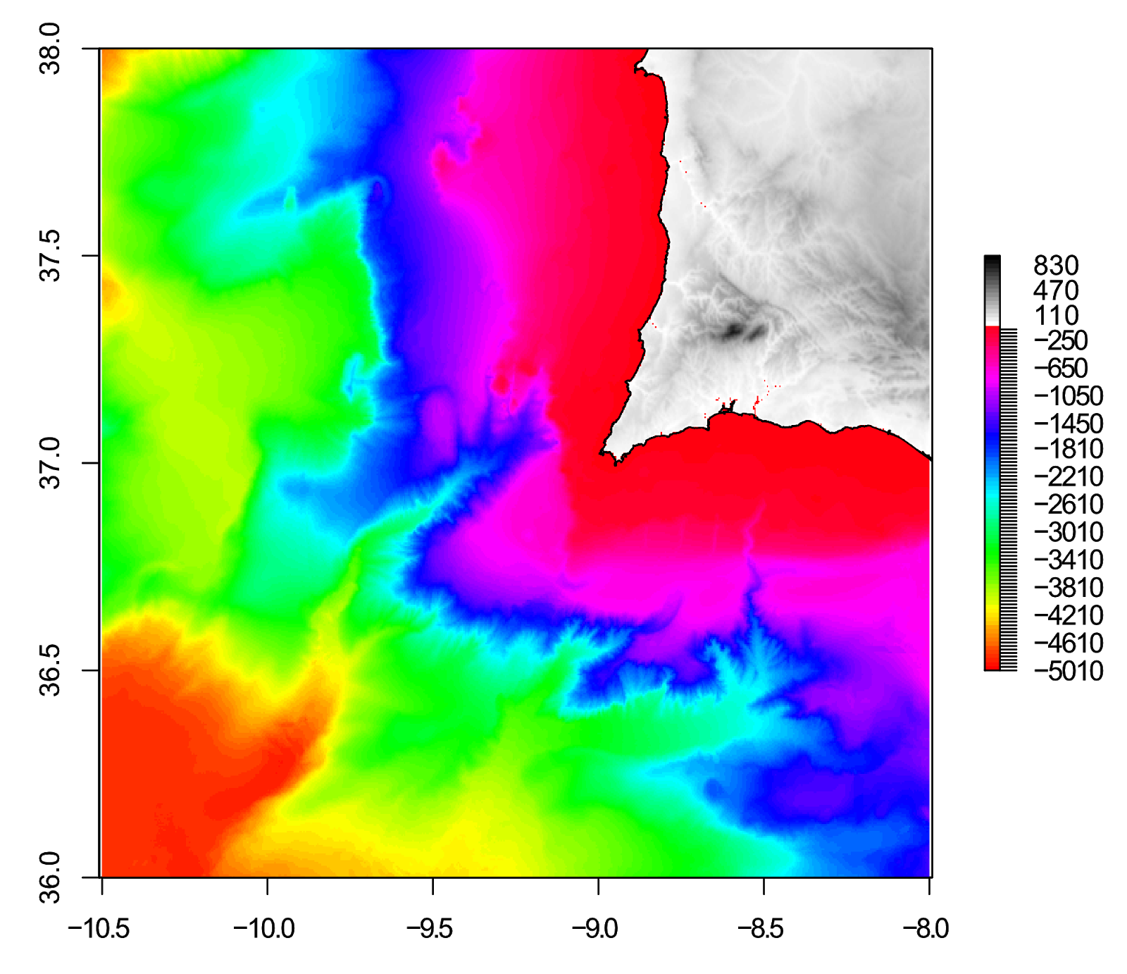
Let's create another crop of the data, zoomed in on a small area:
# Crop of Portugal
pr2.gebco <- crop(gebco, extent(-10.5, -8, 36, 38))
Since we cropped our bathymetric data, we need to rerun the function to create the break points. But, lets also create two sets of break points and colour schemes, a "low res" and a "high res" version. We'll then plot the results to compare.
# Create break points
# "low res"
pr2.br1 <- colbr(pr2.gebco, b1=10, b2=10)
# "high res"
pr2.br2 <- colbr(pr2.gebco, b1=100, b2=100, r1=-1, r2=-1)

# Comparison plot
layout(matrix(1:2, ncol=2))
plot(pr2.gebco, col=c(blue.col(pr2.br1[[1]]), terrain.colors(pr2.br1[[2]])), breaks=pr2.br1[[3]], main="Low res colours")
plot(pr, add=TRUE)
plot(pr2.gebco, col=c(blue.col(pr2.br2[[1]]), terrain.colors(pr2.br2[[2]])), breaks=pr2.br2[[3]], main="High res colours")
plot(pr, add=TRUE)
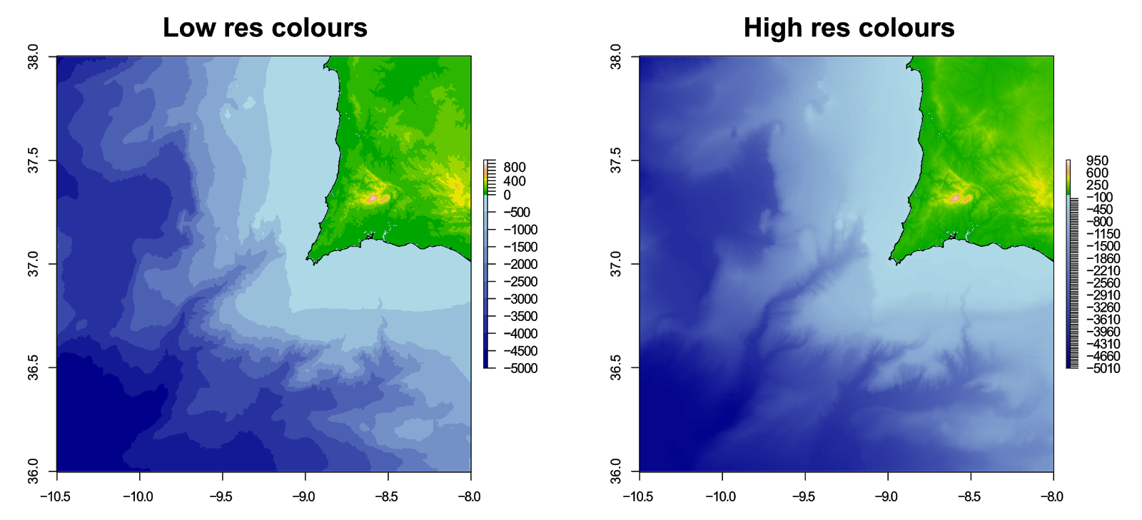
You can change the colour palettes used to create the colour scheme at any time, without running the points break function again.
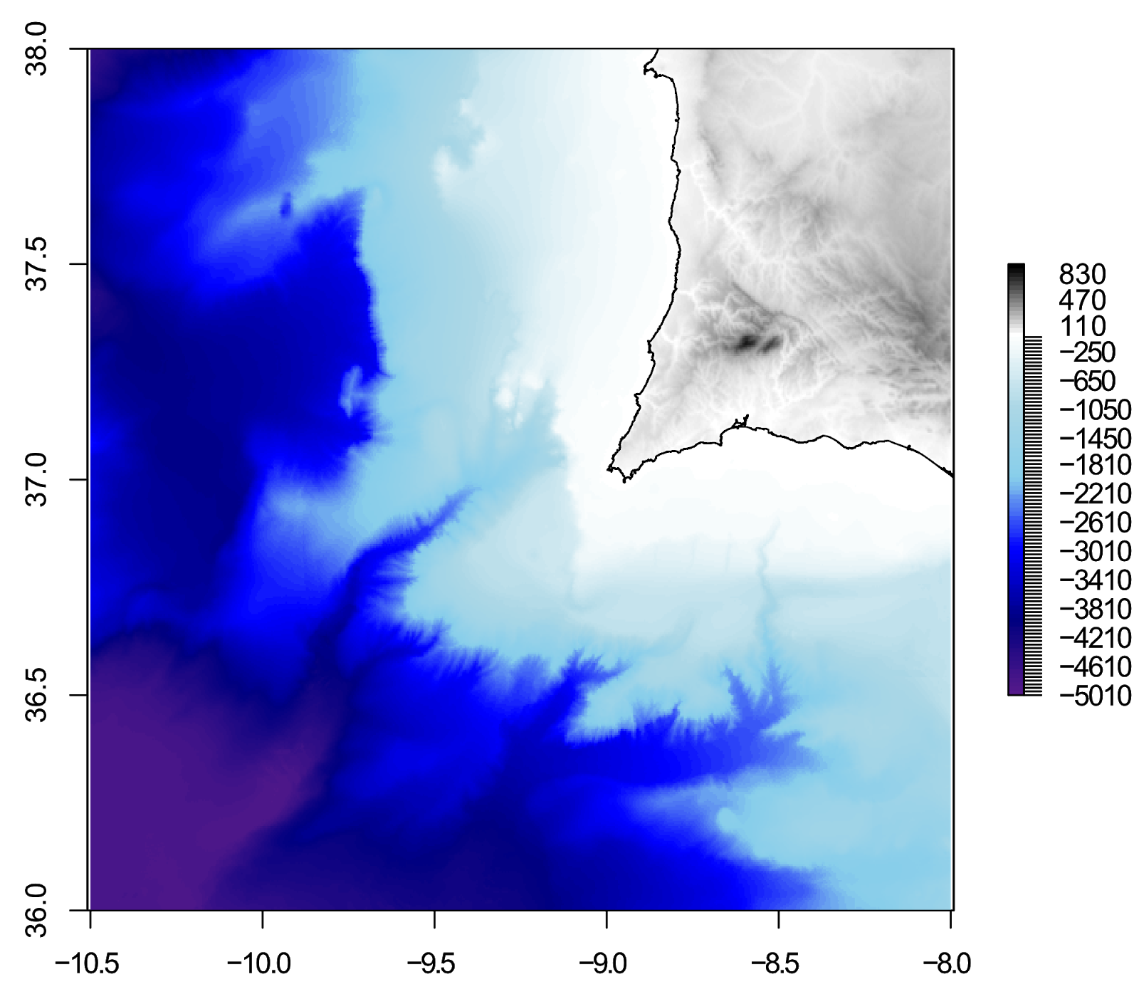
# Colour palettes
water.col <- colorRampPalette(c("purple4", "navy", "blue", "skyblue", "lightblue", "white"))
grey.col <- colorRampPalette(c("white", "black"))
# Plot (high res)
plot(pr2.gebco, col=c(water.col(pr2.br2[[1]]), grey.col(pr2.br2[[2]])), breaks=pr2.br2[[3]])
plot(pr, add=TRUE)
Of course, you could go crazy with colours:
# Plot (high res)
plot(pr2.gebco, col=c(rainbow(pr2.br2[[1]]), grey.col(pr2.br2[[2]])), breaks=pr2.br2[[3]])
plot(pr, add=TRUE)
So, this guide turned into a really in-depth look at using break points to control colour on raster plots in R! Thanks for reading, please leave any comments of questions below.
This is a 2 part guide:
| Part 1: Getting and plotting data | How to create bathymetric maps in R using freely available data from online sources. |
| Part 2: Colour palettes and break points | How to create effective colour schemes using break points, which is useful for when plotting bathymetric maps. |
Further reading
Bathymetric maps in R: Getting and plotting data - Part 1 of this guide showing how and where to get bathymetry data and how to import it into R.
Creating simple location maps in R - A guide to show you how to create simple location maps (a large overview, an small study area map), including adding points of interest, grids, scale bars and north arrows. No GIS skills needed!
DEMs and where to find them - A look at different freely available Digital Elevation Models (DEMs), where to get the data and how to use them in R.
Ben this post is so useful, thank you!
ReplyDeleteI was just wondering if you have any tips on how to tidy up my scale bar? It's currently a messy -7400 to 4200m with 30 breaks below sea level and 10 above.
Hi, glad it was useful!
DeleteI had intended to follow up this guide with another guide on "fixing" the scale bar - unfortunately real life got in the way and I never had a chance to write it.
It is still on the to do list - for now, I suggest you edit the scale in a graphics editor to remove all the extra breaks. Hopefully I'll have some blog updates in the near future :)
Best wishes,
Ben
Oh for sure, no problem, I totally know where you're coming from! I'll keep my eye out for updates. Thanks again, it's really well written and easy to follow :o)
DeleteJude