R has some great GIS capabilities thanks to an extensive range of packages for handling GIS data. I have previously shown some of this capability for creating climate data maps, although I have not explored mapping basics, until now.
This guide will show you some basic techniques for creating simple, yet effective location maps in R, using freely available data. Stop using screenshots of Google Earth for your location maps, and start making your own! No GIS skills are needed. Read on to see how the create the map below!
Guide Information
| Title | Creating simple location maps in R |
| Author | Benjamin Bell |
| Published | August 12, 2019 |
| Last updated | |
| R version | 3.6.0 |
| Packages | base; raster |
| Navigation |
Overview
In this guide, I will show you how to create a simple location map (actually, two maps including; a large overview map, and a close-up map of our study area) using freely available data and some simple R code. R is also capable of doing a range of spatial analysis, and can be used as a fully fledged GIS application - but that is for future guides.
We'll use a Digital Elevation Model (DEM) and some shapefiles (format for storing geographic data) to create the location map. There are many sources for GIS data, and it is available at many resolutions. For this guide, we'll use the data that can be downloaded directly from within R.
To get started, we'll use the "raster" package. If you do not already have this package installed, use install.packages("raster") to install it from within the R console.
If you have previously installed the package, it is a good idea to check for updates (you should do this periodically). Type update.packages() to check for any updates, and follow the on screen prompts.
Getting the GIS data
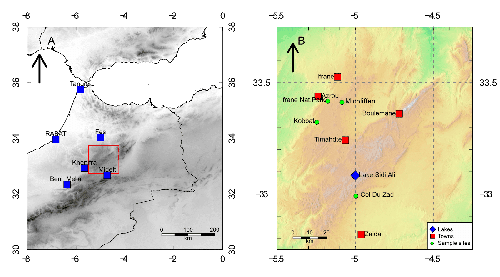
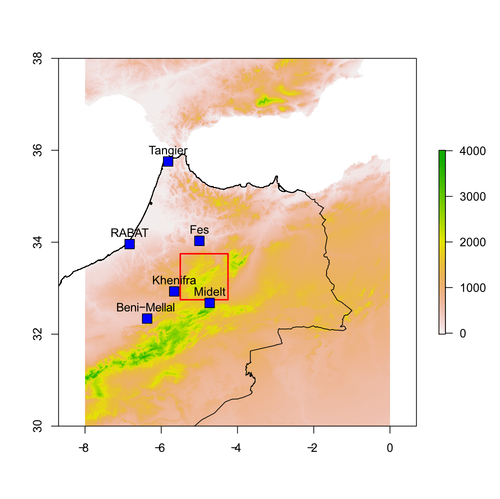
For this guide, we'll create a map of some sites in the Middle Atlas, Morocco. We'll need a DEM of Morocco, and some country shapefiles. To download the data, run the following code:
# Load libraries
library(raster)
# Set working folder (to store data files)
setwd("/your R folder/Mapping")
# Download map data - Country shapefile
ma.s <- getData("GADM", country="MA", level=0)
# DEM tiles
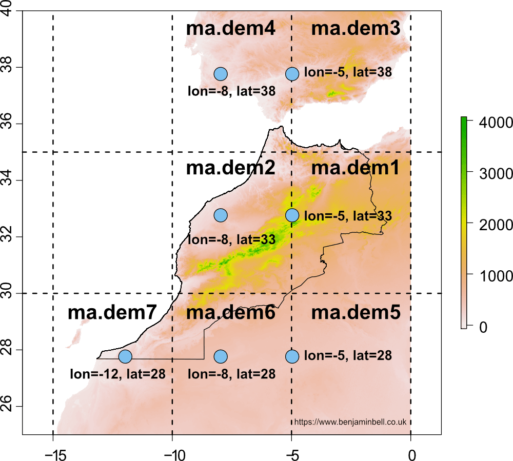
ma.dem1 <- getData("SRTM", lon=-5, lat=33)
ma.dem2 <- getData("SRTM", lon=-8, lat=33)
ma.dem3 <- getData("SRTM", lon=-5, lat=38)
ma.dem4 <- getData("SRTM", lon=-8, lat=38)
ma.dem5 <- getData("SRTM", lon=-5, lat=28)
ma.dem6 <- getData("SRTM", lon=-8, lat=28)
ma.dem7 <- getData("SRTM", lon=-12, lat=28)
The first item we downloaded was a country level shapefile from GADM for Morocco. The country was specified using the country argument and a 2 digit ISO 3166-1 code (MA). You can find a list of these codes on Wikipedia, the 3 digit codes will also work.
The level=0 argument tells R to download only the outer country shapefile (without additional administrative boundaries). Additional levels are available which will also include local regional data. Take a look at the GADM page for Morocco to see what data is available.
The second item we downloaded was a 90 m resolution DEM: Shuttle Radar Topography Mission (SRTM) data, from CGIAR-CSI. The DEM covers the whole world, but data is split into "tiles". For Morocco, we need to download 7 separate tiles to cover the entire country
So, how do you know which DEM tiles to download, and how do you specify them?
This is a good question! The best way to start gathering the DEM data is to focus on the area you wish to map (in this example, the Middle Atlas). So, specify the coordinates for your study area lon=-5, lat=33 to download the first tile.
Lets take a look at the first map tile in R:
plot(ma.dem1)
plot(ma.s, add=TRUE)
# Coordinates for the map tile
points(-5, 33, pch=21, bg="skyblue2", cex=4)
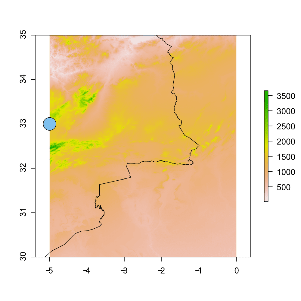
I've also added a point to the map to show the coordinates which were used to download the DEM tile. Any coordinates which fall within the boundary of the tile, including those specified on the left boundary (as in this example), or bottom boundary will download that tile.
You can see that the grid tile is 5° x 5°, therefore, to download the remaining tiles, you should specify coordinates for the rest of the country using the first tile as a reference (refer back to the code above for details).
Once you have downloaded all the tiles, you can merge them together using the mosaic function to create a single DEM for Morocco:
# Merge DEMs
ma.dem <- mosaic(ma.dem1, ma.dem2, ma.dem3, ma.dem4, ma.dem5, ma.dem6, ma.dem7, fun=mean)
To make how this code works easier to understand, here is a plot showing the DEM with the different DEM tiles, and the coordinates that were used to download them:
You don't have to use the built DEM (SRTM) for making maps in R. You can use any DEM that you want, check out my guide: DEMs and where to find them for a look at several freely available DEMs, and how to use them in R.
Creating the overview map
Cropping the DEM
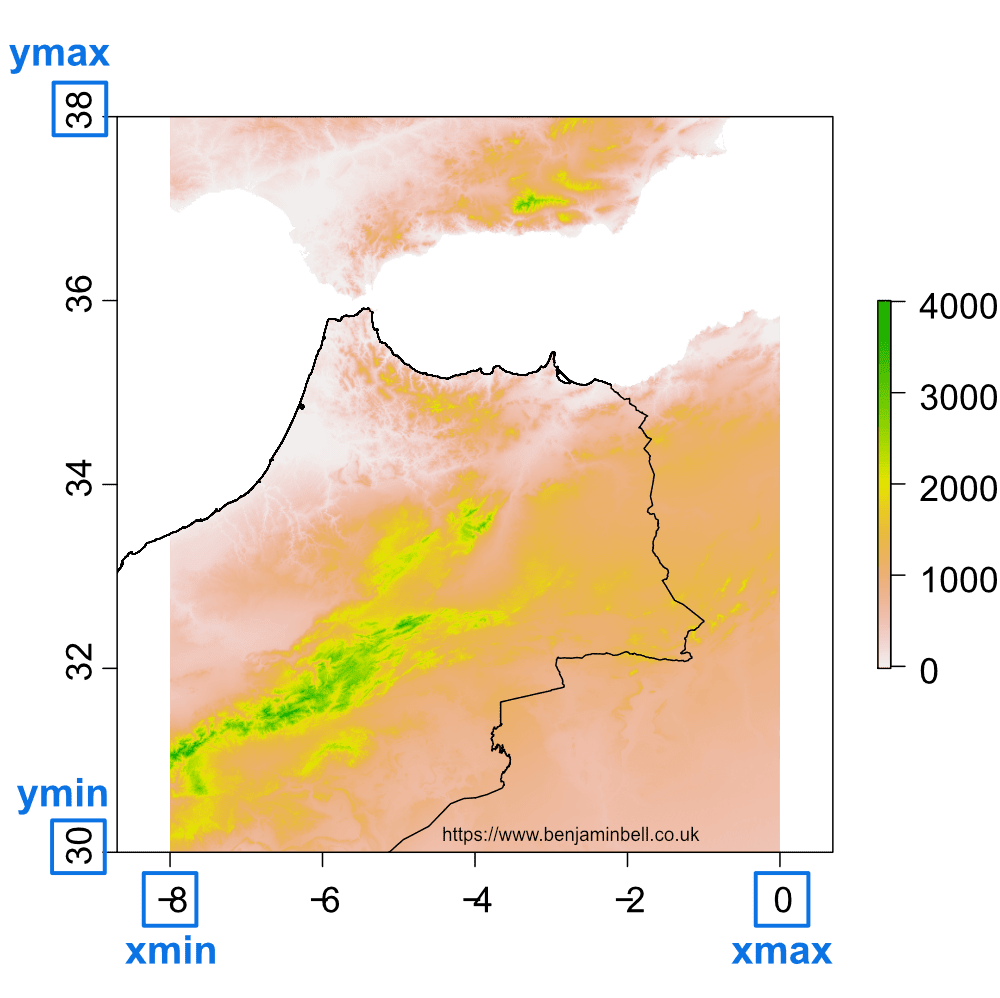
Now that we have the data, lets create the first overview map, showing the wider geographical area. In the previous image, you can see the DEM now covers quite a large geographic area. However, for the map we are going to produce, we'll show a smaller area, so first we'll crop the DEM to show part of Morocco, Algeria, southern Spain and Portugal.
# Crop DEM
ma.dem.c <- crop(ma.dem, extent(-8, 0, 30, 38))
Here, the crop function is used to crop the dem object ma.dem, using the specified extent extent(-8, 0, 30, 38). The numbers in the extent are the coordinates for the xmin, xmax, ymin, and ymax of our cropped area. The below image should make this clearer:
Points of interest
Next, we'll add some points of interest to the map, starting with some place names. An easy way to do this is to create two vectors containing longitude and latitude coordinates, and a third vector containing the place names. You can get the coordinates using Google maps if you do not know them. In R, you should specify the longitude first (x axis) followed by the latitude (y axis).
# Create points of interest
place <- c("Midelt", "Khenifra", "Fes", "RABAT", "Beni-Mellal", "Tangier")
p.lon <- c(-4.73, -5.66,  -5.00, -6.83, -6.37, -5.82)
p.lat <- c(32.68, 32.93, 34.03, 33.96, 32.34, 35.756)

# Add points to map
points(p.lon, p.lat, pch=22, col="black", bg="blue", cex=2)
# Add place names to map
text(p.lon, p.lat, labels=place, cex=1, pos=3)
We'll also create a bounding box to show the area of our close-up map (which we'll create in the next section), using the rect function.
# Bounding box
rect(-5.5, 32.75, -4.25, 33.75, border="red", lwd=2)
Map colour scheme
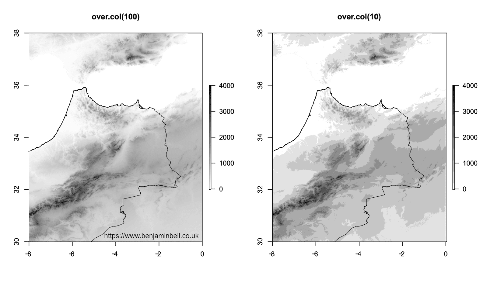
Let's also change the terrain colour for our map. Since this is just the overview map, and not the main focus, lets create a greyscale colour scheme using the colorRampPalette function.
# Overview map terrain colour
over.col <- colorRampPalette(c("white", "black"))
To use the colour ramp palette, when plotting, specify the object followed by a number in parentheses, which tells R the number of colours to produce between the specified colours in the object. For example:
# Plot overview map
plot(ma.dem.c, col=over.col(100))
This would produce a greyscale map. You can see the colours generated by the typing it into the R console:
> over.col(100)
  [1] "#FFFFFF" "#FCFCFC" "#F9F9F9" "#F7F7F7"
  [5] "#F4F4F4" "#F2F2F2" "#EFEFEF" "#ECECEC"
  [9] "#EAEAEA" "#E7E7E7" "#E5E5E5" "#E2E2E2"
 [13] "#E0E0E0" "#DDDDDD" "#DADADA" "#D8D8D8"
 [17] "#D5D5D5" "#D3D3D3" "#D0D0D0" "#CECECE"
 [21] "#CBCBCB" "#C8C8C8" "#C6C6C6" "#C3C3C3"
 [25] "#C1C1C1" "#BEBEBE" "#BCBCBC" "#B9B9B9"
 [29] "#B6B6B6" "#B4B4B4" "#B1B1B1" "#AFAFAF"
 [33] "#ACACAC" "#AAAAAA" "#A7A7A7" "#A4A4A4"
 [37] "#A2A2A2" "#9F9F9F" "#9D9D9D" "#9A9A9A"
 [41] "#979797" "#959595" "#929292" "#909090"
 [45] "#8D8D8D" "#8B8B8B" "#888888" "#858585"
 [49] "#838383" "#808080" "#7E7E7E" "#7B7B7B"
 [53] "#797979" "#767676" "#737373" "#717171"
 [57] "#6E6E6E" "#6C6C6C" "#696969" "#676767"
 [61] "#646464" "#616161" "#5F5F5F" "#5C5C5C"
 [65] "#5A5A5A" "#575757" "#545454" "#525252"
 [69] "#4F4F4F" "#4D4D4D" "#4A4A4A" "#484848"
 [73] "#454545" "#424242" "#404040" "#3D3D3D"
 [77] "#3B3B3B" "#383838" "#363636" "#333333"
 [81] "#303030" "#2E2E2E" "#2B2B2B" "#292929"
 [85] "#262626" "#242424" "#212121" "#1E1E1E"
 [89] "#1C1C1C" "#191919" "#171717" "#141414"
 [93] "#121212" "#0F0F0F" "#0C0C0C" "#0A0A0A"
 [97] "#070707" "#050505" "#020202" "#000000"
Try changing the value for different colour schemes: over.col(100) vs. over.col(10)
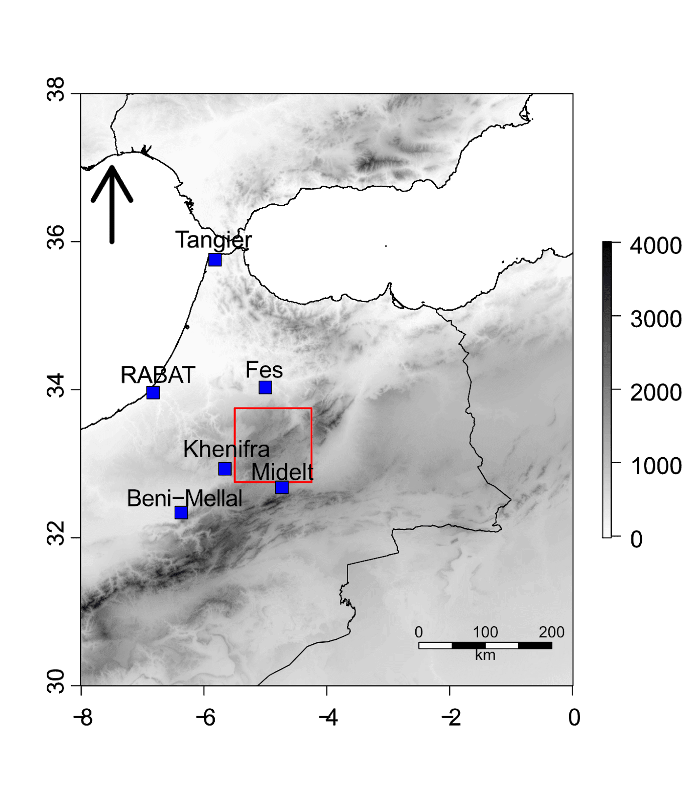
Scale bar and north arrow
No location map is complete without a scale bar and north arrow, so lets add them.
# Scale bar
scalebar(d=200, below="km", type="bar", divs=4, xy=c(-2.5,30.5), lonlat=TRUE, cex=1)
# North Arrow
arrows(x0=-7.5, y0=36, x1=-7.5, y1=37, length=0.4, lwd=5)
The scalebar is created using the scalebar function from the raster package. The d=200 argument specifies the distance the scale bar should represent. This is based on the DEM we are plotting, and here we have specified 200 km. The divs argument plots the number of divisions on the scale bar, while the xy argument specifies the coordinates (based on your map) of where the scale bar should be placed.
The north arrow is created using the arrows function. Simply specify the start and end coordinates (both x and y) for the arrow to plot. The length argument specifies the size of the arrow head.
For completeness, we'll also add the additional shapefiles for countries visible in the map.
# Download country shapefiles
es.s <- getData("GADM", country="ESP", level=0)
pr.s <- getData("GADM", country="PRT", level=0)
dz.s <- getData("GADM", country="DZA", level=0)
Now, lets bring everything together - here's the plot code needed to generate the overview map, and the result:
# Plot map with greyscale terrain
plot(ma.dem.c, col=over.col(100))
# Add the country shapefiles
plot(ma.s, add=TRUE)
plot(es.s, add=TRUE)
plot(pr.s, add=TRUE)
plot(dz.s, add=TRUE)
# Bounding box
rect(-5.5, 32.75, -4.25, 33.75, border="red", lwd=2)
# Points of interest
points(p.lon, p.lat, pch=22, col="black", bg="blue", cex=2)
text(p.lon, p.lat, labels=place, cex=1, pos=3)
# Scale bar
scalebar(200, below="km",type="bar", divs=4, xy=c(-2.5,30.5), lonlat=TRUE, cex=1)
# North Arrow
arrows(x0=-7.5, y0=36, x1=-7.5, y1=37, length=0.4, lwd=5)
Creating the close-up map
In the previous section, I showed you how to create a map showing an overview of the geographical area. Here, we will create a smaller, close-up map showing the area denoted by the bounding box (our study area). We'll create the map in the same way, but with a few differences. The close-up map is useful for showing a more detailed look at the study area, or for plotting sampling sites.
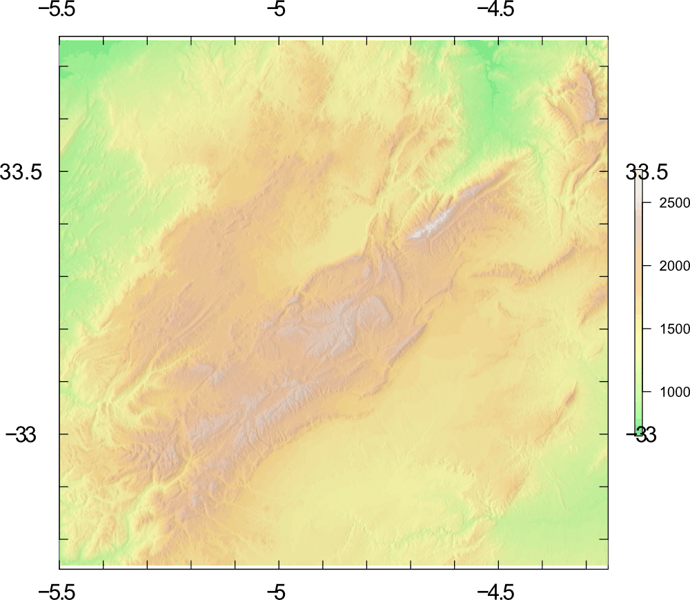
We'll start by creating a new crop of the DEM, which will cover our close-up, or study area map.
# Crop DEM to study area
mid.dem <- crop(ma.dem, extent(-5.5, -4.25, 32.75, 33.75))
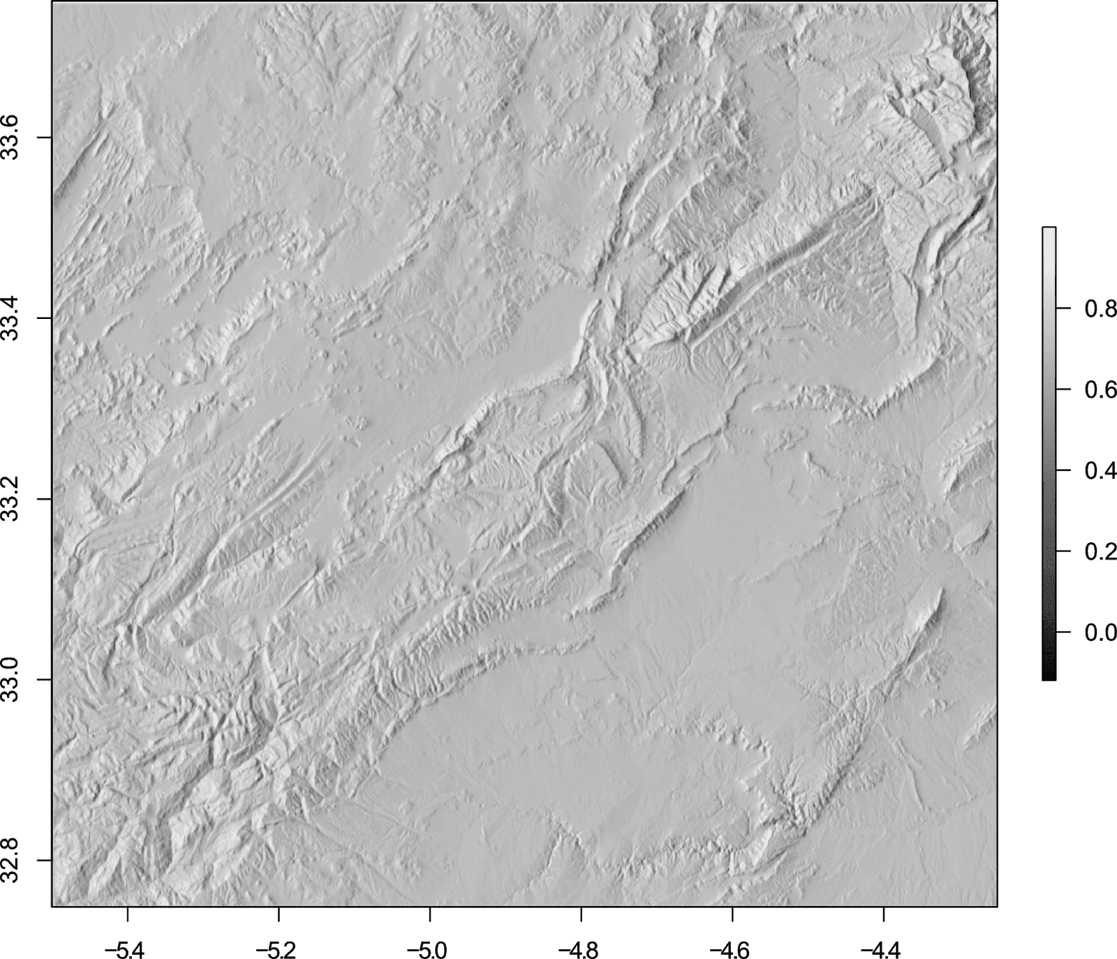
Hill shade
To give the map a 3D effect and to make the terrain look more realistic, we will create a hill shade layer. To calculate the hill shade layer, you first need to calculate the slope and aspect layers:
# Create Hill shade
slope <- terrain(mid.dem, opt="slope")
aspect <- terrain(mid.dem, opt="aspect")
hill <- hillShade(slope, aspect, angle=45, direction=275)
After calculating the slope and aspect layers, you specify these objects as arguments in the hillShade function. The angle argument is the elevation angle of the light source (i.e. the sun), and the direction argument specifies the direction of the light source.
You can change these values to get different hill shade effects. We'll use the colour palette created for the overview map to plot our hill shade. However, we'll reverse this colour scheme (using the rev() function), so that our greyscale is created black to white (rather than white to black).
# Plot hill shade
plot(hill, col=rev(over.col(100)))
To make the hill shade look more effective, we will overlay our DEM. The default colour scheme for raster plots uses the built in terrain.colors() palette. Other default colour options include the topo.colors() palette - see ?terrain.colors for details and the image below.
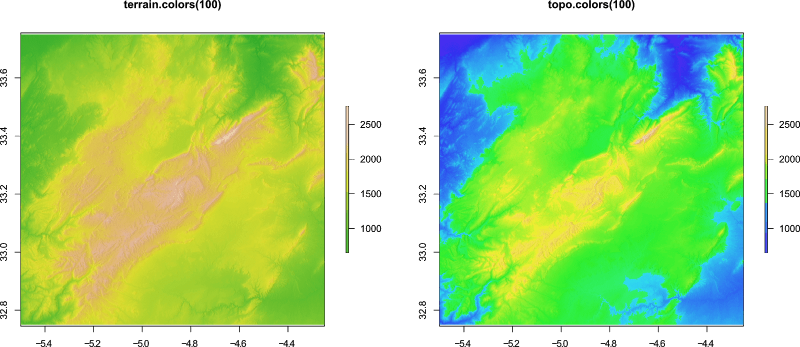
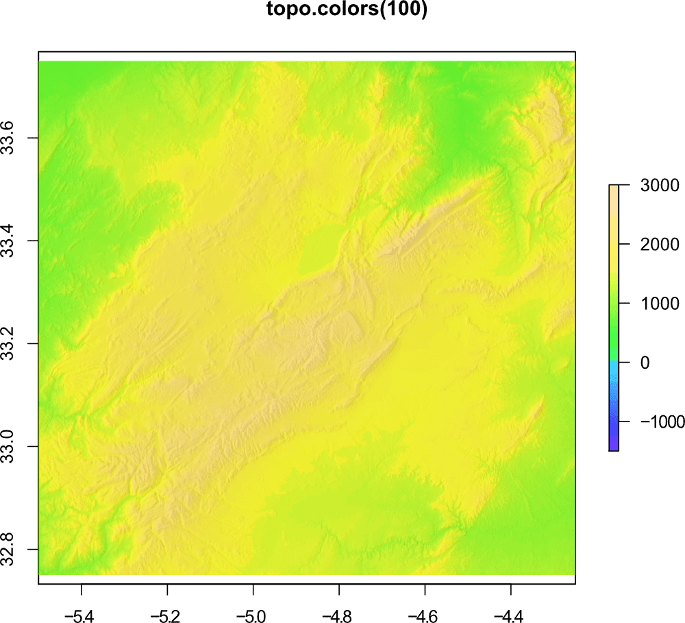
The topo.colors() scheme is useful when your DEM also shows the sea as well as land. However, in our example the colour scheme is not effective because we have no sea, and the blue implies water. Additionally setting the zlim argument will ensure that that land uses the appropriate colours:
# Zlim
plot(mid.dem, zlim=c(-1500, 3000), col=topo.colors(100))
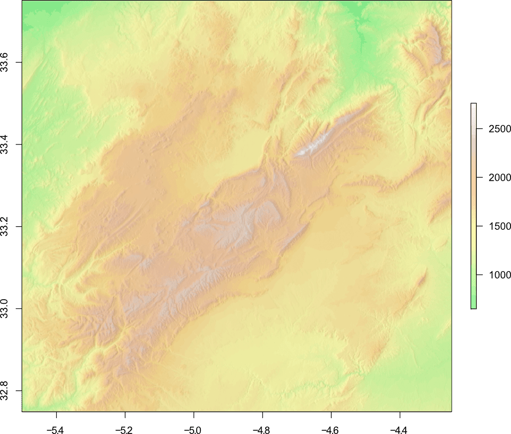
You can also use your own colour scheme for terrain (as we did in the overview map), so for this map, we'll define a custom scheme (this scheme is based on a colour palette available in QGIS).
# Terrain colour palette
map.col <- c(rgb(84,229,151,maxColorValue=255), rgb(97,240,130,maxColorValue=255),  rgb(115,247,117,maxColorValue=255), rgb(148,254,133,maxColorValue=255), rgb(158,254,135,maxColorValue=255), rgb(173,253,136,maxColorValue=255), rgb(180,254,139,maxColorValue=255), rgb(189,254,140,maxColorValue=255), rgb(197,253,141,maxColorValue=255), rgb(207,254,144,maxColorValue=255), rgb(215,254,146,maxColorValue=255), rgb(223,254,147,maxColorValue=255), rgb(231,254,149,maxColorValue=255), rgb(238,253,151,maxColorValue=255), rgb(247,254,154,maxColorValue=255), rgb(254,254,155,maxColorValue=255), rgb(253,252,151,maxColorValue=255), rgb(254,248,149,maxColorValue=255), rgb(253,242,146,maxColorValue=255), rgb(254,238,146,maxColorValue=255), rgb(253,233,140,maxColorValue=255), rgb(254,225,135,maxColorValue=255), rgb(253,219,127,maxColorValue=255), rgb(254,215,121,maxColorValue=255), rgb(253,206,125,maxColorValue=255), rgb(250,203,128,maxColorValue=255), rgb(248,197,131,maxColorValue=255), rgb(246,197,134,maxColorValue=255), rgb(244,197,136,maxColorValue=255), rgb(242,190,139,maxColorValue=255), rgb(240,188,143,maxColorValue=255), rgb(238,187,145,maxColorValue=255), rgb(235,188,153,maxColorValue=255), rgb(235,194,164,maxColorValue=255), rgb(232,197,172,maxColorValue=255), rgb(230,200,177,maxColorValue=255), rgb(223,198,179,maxColorValue=255), rgb(221,199,183,maxColorValue=255), rgb(224,207,194,maxColorValue=255), rgb(228,214,203,maxColorValue=255), rgb(232,221,212,maxColorValue=255), rgb(235,226,219,maxColorValue=255), rgb(239,231,225,maxColorValue=255), rgb(243,238,234,maxColorValue=255), rgb(246,240,236,maxColorValue=255), rgb(250,249,248,maxColorValue=255))
To ensure that the hill shade is still visible when we overlay the DEM, we will use the adjustcolor function to specify a transparency (alpha) channel for our colour scheme:
# Plot hill shade and overlay DEM
plot(hill, col=rev(over.col(100)), legend=FALSE)
plot(mid.dem, col=adjustcolor(map.col, 0.75), add=TRUE)
Since we want the legend to reflect the values and colour scheme of our DEM, we use the argument legend=FALSE in the hill shade plot code.
We set the visibility of the DEM to 75% adjustcolor(map.col, 0.75), and the resulting plot is quite effective:
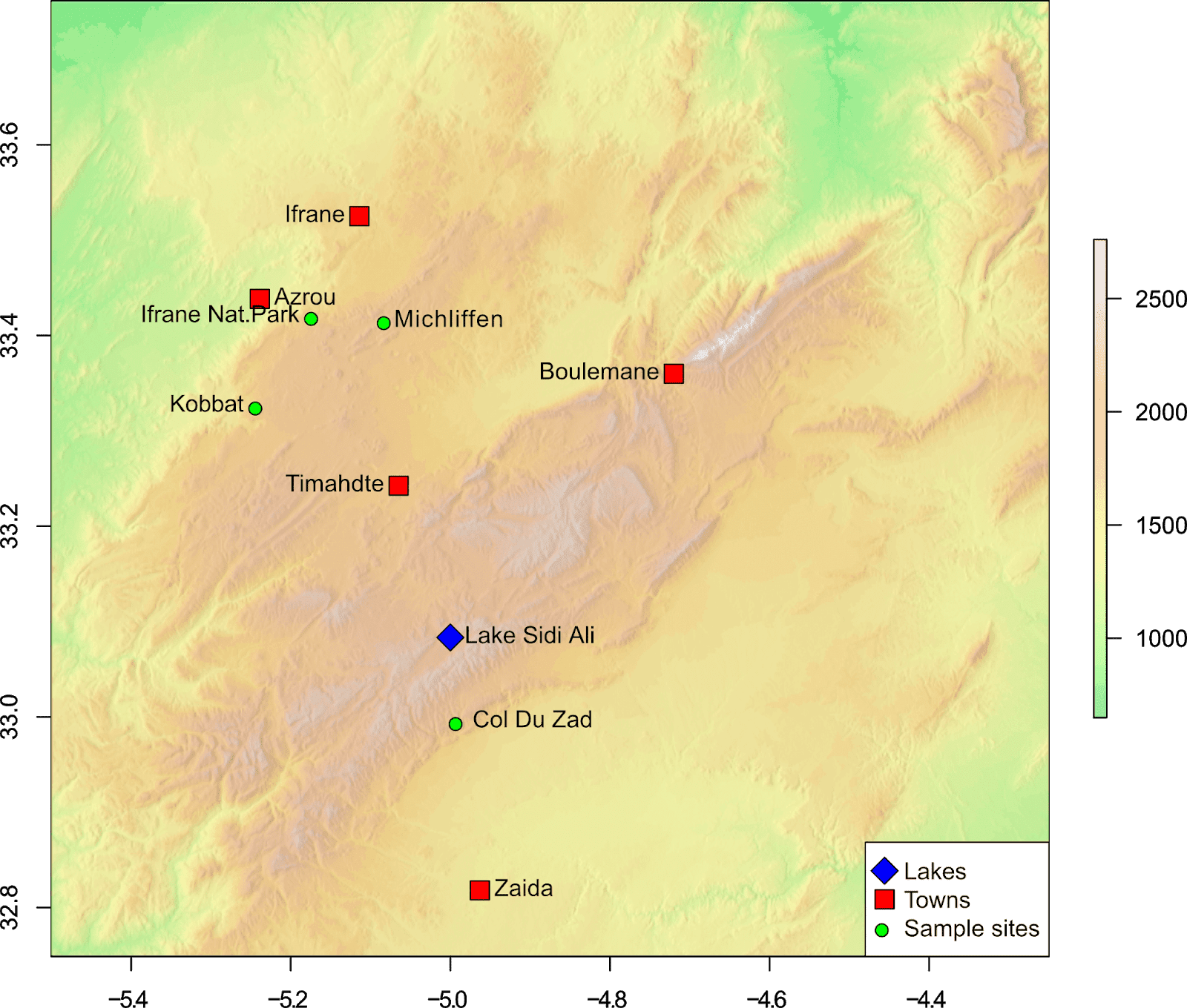
Points of interest part deux
For the overview map, we created our points of interest using vectors. Here, we'll instead import a .csv file (called "poi.csv" located in our R working directory) containing our points of interest. The file contains different "types" of points of interest: places, sample sites, and lakes. You can download the file from Google Sheets (or recreate it using the data below).
# Import points of interest file
poi <- read.csv("poi.csv")
We can look at the imported data in R:
> poi
       lon     lat            name   type
1  -5.0000 33.0833   Lake Sidi Ali   lake
2  -5.0648 33.2424        Timahdte  place
3  -5.2388 33.4384           Azrou  place
4  -5.1140 33.5251          Ifrane  place
5  -4.9630 32.8180           Zaida  place
6  -4.7200 33.3600       Boulemane  place
7  -5.0800 33.4150      Michliffen sample
8  -5.1710 33.4200 Ifrane Nat.Park sample
9  -4.9900 32.9950      Col Du Zad sample
10 -5.2410 33.3260          Kobbat sample
And we could plot the points of interest using the following code:
# Add to map
points(poi$lon, poi$lat)
text(poi$lon, poi$lat, labels=poi$name, poi$lat, cex=1, pos=2)
The problem with the above code is that all the points would be plotted using the same symbol and colour. To get around this, we will create two vectors and assign a pch symbol or colour based on the value of the type column.
# Create pch symbol vector
poi.s <- as.numeric(poi$type)
# Replace values
poi.s[poi.s==1] <- 23
poi.s[poi.s==2] <- 22
poi.s[poi.s==3] <- 21

# Create colour vector
poi.c <- as.character(poi$type)
# Replace values
poi.c[poi.c=="lake"] <- "blue"
poi.c[poi.c=="place"] <- "red"
poi.c[poi.c=="sample"] <- "green"
In the first part of this code, the values in the "type" column of the "poi" data frame are converted to numeric values (1, 2, 3). Each unique value in the column will get a unique numeric value. Each of these values is then replaced with a different numeric value to specify the pch symbol to use. Check out my guide to pch symbols in R for details of available pch symbols - you can use any symbol you like!
So, for poi.s[poi.s==1] <- 23, the values matching "1" in the poi.s object are replaced with "23". Here are the values before and after running the code:
Data frame:
> poi$type
 [1] lake   place  place  place  place  place  sample sample sample sample
Levels: lake place sample
Conversion to numeric:
> poi.s
  [1] 1 2 2 2 2 2 3 3 3 3
Replacement values (pch symbols)
> poi.s
  [1] 23 22 22 22 22 22 21 21 21 21
Similarly, in the second part of the code, the "type" column is replaced with a character vector (with the same values). These values are then replaced with a colour depending on the type.
Conversion to character:
> poi.c
  [1] "lake"   "place"  "place"  "place"  "place"  "place"  "sample" "sample" "sample"
[10] "sample"
Replacement values (colours)
> poi.c
  [1] "blue"  "red"   "red"   "red"   "red"   "red"   "green" "green" "green" "green"
Now to plot the different symbols and colours, you simply specify these vectors as arguments in the points function:
# Add points to map
points(poi$lon, poi$lat, pch=poi.s, bg=poi.c, cex=2)
For the text labels, to avoid some overcrowding, we will alternate the position (pos) of these labels:
# Add text labels to map
text(poi$lon, poi$lat, labels=poi$name, poi$lat, cex=1, pos=c(4,2))
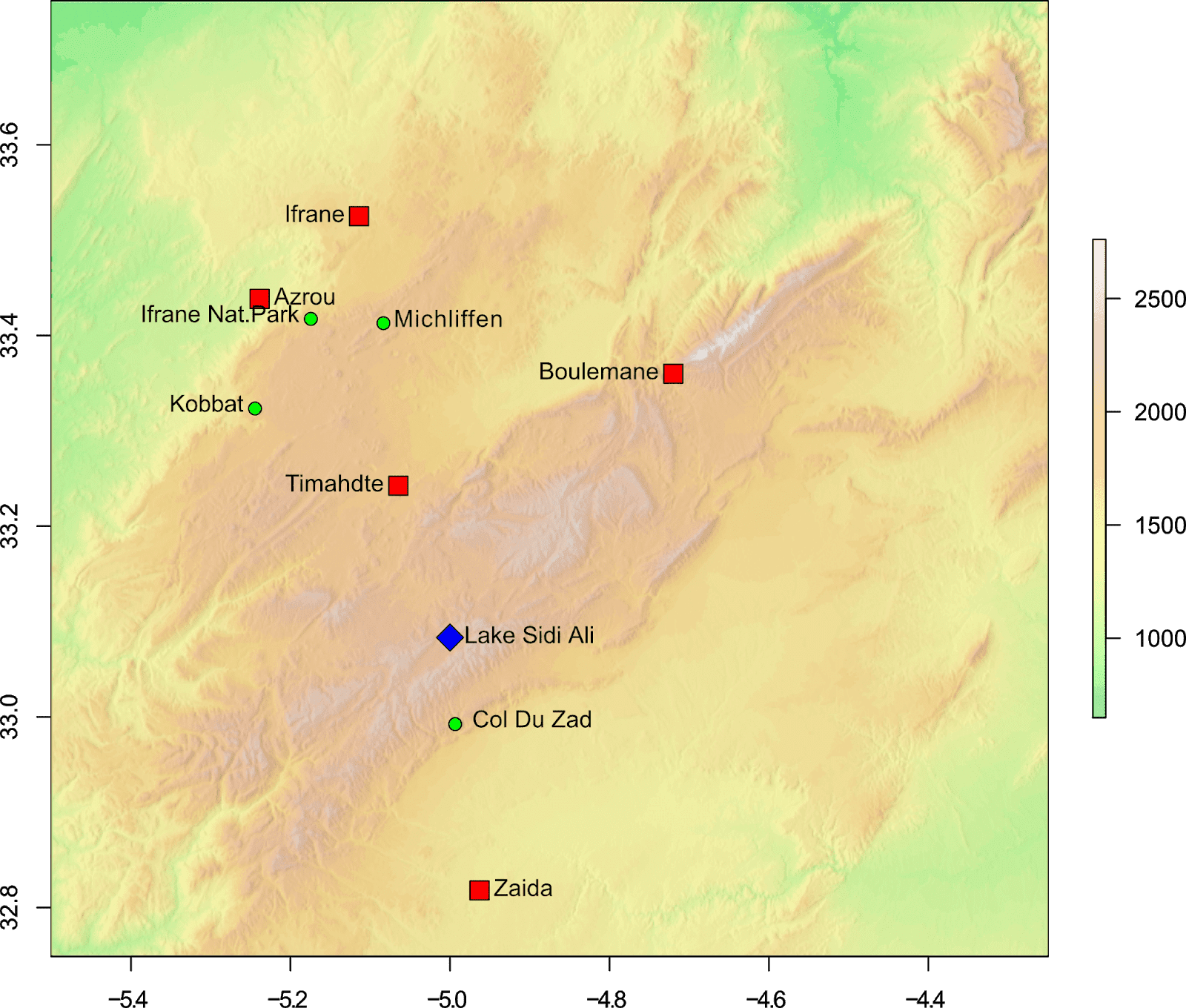
Legends
Adding a legend to the map is very easy, and achieved using the legend function. For our map, we want the legend to identify the different points, and this can be done with the following code:
# Legend
legend("bottomright", legend=c("Lakes", "Towns", "Sample sites"), pch=c(23, 22, 21), pt.bg=c("blue", "red", "green"), pt.cex=2, bg="white")
The position of the legend has been specified using a keyword "bottomright", this can also be specified using x and y coordinates. The legend text is specified using the legend argument, while the symbols and colours are specified using the pch and pt.bg arguments respectively. If you want the legend to stand out, specify the background colour using the bg argument.
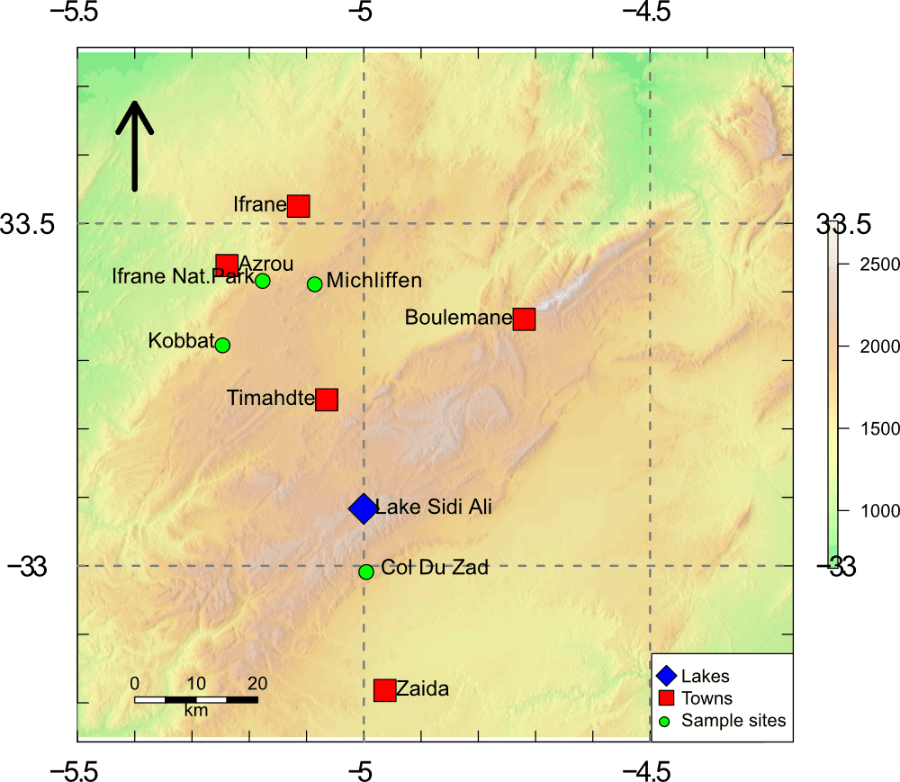
Grids
Grids can be a useful addition to maps, and they are also easy to add using the grid function from the raster package. The default arguments for the grid function (see ?grid) usually produce a sufficient looking grid, where the grid lines up with the axis ticks.
# Add a map grid
grid(col="grey50", lwd=2)
But, you could specify more or less grid lines by using the nx and ny arguments:
# Add a map grid
grid(nx=4, ny=4, col="grey50", lwd=2)
However, the grid lines may no longer line up with the axis ticks.

An alternative option is to create the grid using the abline function. This way you can specify exactly where the grid lines appear, for example:
# Add a map grid using abline
# Vertical lines
abline(v=-5, col="grey50", lwd=2, lty=2)
abline(v=-4.5, col="grey50", lwd=2, lty=2)
# Horizontal lines
abline(h=33, col="grey50", lwd=2, lty=2)
abline(h=33.5, col="grey50", lwd=2, lty=2)
This code will create vertical and horizontal lines in the positions specified, producing a grid exactly where you want. In this example, a 0.5° by 0.5° grid.

Map axes
In all of our examples so far, we have used the default axes and labels as produced by R. You can generate your own axes and labels by specifying them yourself, and add additional axes to additional sides of the map.
Lets create custom axes for our map that will appear on all sides, with tick marks every 0.1°, and labels every 0.5°. We'll also put the tick marks on the inside of the map. To ensure that R does not add the default axes, we'll add the argument axes=FALSE to the plot code.
# Tick marks - 0.1 degree
xa <- seq(from=-5.5, to=-4, by=0.1)
ya <- seq(from=32.5, to=34, by=0.1)
# Tick labels - 0.5 degree
xl <- c(-5.5, NA, NA, NA, NA, -5.0, NA, NA, NA, NA, -4.5, NA, NA, NA, NA, -4.0)
yl <- c(32.5, NA, NA, NA, NA, -33.0, NA, NA, NA, NA, 33.5, NA, NA, NA, NA, 34)
In this code, the position of the ticks are specified by creating a sequence seq of numbers, which correspond to the map coordinates (this is done for both the x and y axis).
Since we only want the labels to appear on specific tick marks, we also specify this by creating a vector with our labels, using NA where we do not want a label to appear. The number of labels must be the same as the number of tick marks.
These are then added to the map using the following code:
# Plot map
plot(hill, col=rev(over.col(100)), legend=FALSE, axes=FALSE)
plot(mid.dem, col=adjustcolor(map.col, 0.75), axes=FALSE, add=TRUE)
# Add axes
axis(side=1, tcl=0.5, at=xa, labels=xl, cex.axis=1.6)
axis(side=2, tcl=0.5, las=1, at=ya, labels=yl, cex.axis=1.6)
axis(side=3, tcl=0.5, at=xa, labels=xl, cex.axis=1.6)
axis(side=4, tcl=0.5, las=1, at=ya, labels=yl, pos=-4.25, cex.axis=1.6)
Individual axis are added using the axis function. The side argument refers to the side that the axis should appear. 1 = bottom, 2 = left, 3 = top, 4 = right. The tcl=0.5 argument plots the tick marks on the inside of the map. The default tcl=-0.5 would plot the tick marks on the outside.
The at argument tells R where to put the tick marks, while the labels argument tells R where to put the labels. The las argument is related to the orientation of the tick labels.
Due to an oddity?! (probably related to using 2 plots), the position of the right hand axis axis(4) has an additional argument to specify its position pos=-4.25. Check out ?axis for details of all the settings related to axis.
Bringing all these elements together (including some from the previous section), we can produce a great study location map using the following code:
# Plot map
plot(hill, col=rev(over.col(100)), legend=FALSE, axes=FALSE)
plot(mid.dem, col=adjustcolor(map.col, 0.75), axes=FALSE, add=TRUE)
# Add axes
axis(1, tcl=0.5, at=xa, labels=xl, cex.axis=1.6)
axis(2, tcl=0.5, las=1, at=ya, labels=yl, cex.axis=1.6)
axis(3, tcl=0.5, at=xa, labels=xl, cex.axis=1.6)
axis(4, tcl=0.5, las=1, at=ya, labels=yl, pos=-4.25, cex.axis=1.6)
# grid
abline(v=-5, col="grey50", lwd=2, lty=2)
abline(v=-4.5, col="grey50", lwd=2, lty=2)
abline(h=33, col="grey50", lwd=2, lty=2)
abline(h=33.5, col="grey50", lwd=2, lty=2)
# Points of interest
points(poi$lon, poi$lat, pch=poi.s, bg=poi.c, cex=3)
text(poi$lon, poi$lat, labels=poi$name, poi$lat, cex=1.2, pos=c(4,2))# Add to map
# Legend
legend("bottomright", legend=c("Lakes", "Towns", "Sample sites"), pch=c(23, 22, 21), pt.bg=c("blue", "red", "green"), pt.cex=2, bg="white")
# Scale bar
scalebar(20, below="km",type="bar", divs=4, xy=c(-5.4,32.8), lonlat=TRUE, cex=1)
# North Arrow
arrows(x0=-5.4, y0=33.55, x1=-5.4, y1=33.675, length=0.3, lwd=5)
Bringing both maps together
If you have reached this far into the guide, we have so far created two maps, one an overview map showing the location of our study area, and a map showing the study area itself.
To plot the maps side by side, you can use the layout() function. For details on how this works, check out my guide to creating multi-panel plots. Else, here is the complete code and resulting image:
# Plot both maps
layout(matrix(1:2, ncol=2))
par(mar=c(4, 4, 4, 4))
# Overview map
plot(ma.dem.c, col=over.col(100), axes=FALSE, legend=FALSE)
axis(1, tcl=0.5, cex.axis=1.6)
axis(2, tcl=0.5, cex.axis=1.6)
axis(3, tcl=0.5, cex.axis=1.6)
axis(4, tcl=0.5, cex.axis=1.6)
# Add the country shapefiles
plot(ma.s, add=TRUE)
plot(es.s, add=TRUE)
plot(pr.s, add=TRUE)
plot(dz.s, add=TRUE)
# Bounding box
rect(-5.5, 32.75, -4.25, 33.75, border="red", lwd=2)
# Points of interest
points(p.lon, p.lat, pch=22, col="black", bg="blue", cex=3)
text(p.lon, p.lat, labels=place, cex=1.2, pos=3)
# Scale bar
scalebar(200, below="km",type="bar", divs=4, xy=c(-2.5,30.5), lonlat=TRUE, cex=1)
# North Arrow
arrows(x0=-7.5, y0=36, x1=-7.5, y1=37, length=0.4, lwd=5)
# Add map label
legend("topleft", legend="A", cex=2, bty="n")
###################
# Study map
par(mar=c(4, 4, 4, 4))
plot(hill, col=rev(over.col(100)), legend=FALSE, axes=FALSE)
plot(mid.dem, col=adjustcolor(map.col, 0.75), legend=FALSE, axes=FALSE, add=TRUE)
# Add axes
axis(1, tcl=0.5, at=xa, labels=xl, cex.axis=1.6)
axis(2, tcl=0.5, las=1, at=ya, labels=yl, cex.axis=1.6)
axis(3, tcl=0.5, at=xa, labels=xl, cex.axis=1.6)
axis(4, tcl=0.5, las=1, at=ya, labels=yl, pos=-4.25, cex.axis=1.6)
# grid
abline(v=-5, col="grey50", lwd=2, lty=2)
abline(v=-4.5, col="grey50", lwd=2, lty=2)
abline(h=33, col="grey50", lwd=2, lty=2)
abline(h=33.5, col="grey50", lwd=2, lty=2)
# Points of interest
points(poi$lon, poi$lat, pch=poi.s, bg=poi.c, cex=3)
text(poi$lon, poi$lat, labels=poi$name, poi$lat, cex=1.2, pos=c(4,2))# Add to map
# Legend
legend("bottomright", legend=c("Lakes", "Towns", "Sample sites"), pch=c(23, 22, 21), pt.bg=c("blue", "red", "green"), pt.cex=2, bg="white")
# Scale bar
scalebar(20, below="km",type="bar", divs=4, xy=c(-5.4,32.8), lonlat=TRUE, cex=1)
# North Arrow
arrows(x0=-5.4, y0=33.55, x1=-5.4, y1=33.675, length=0.3, lwd=5)
# Add map label
legend("topleft", legend="B", cex=2, bty="n")
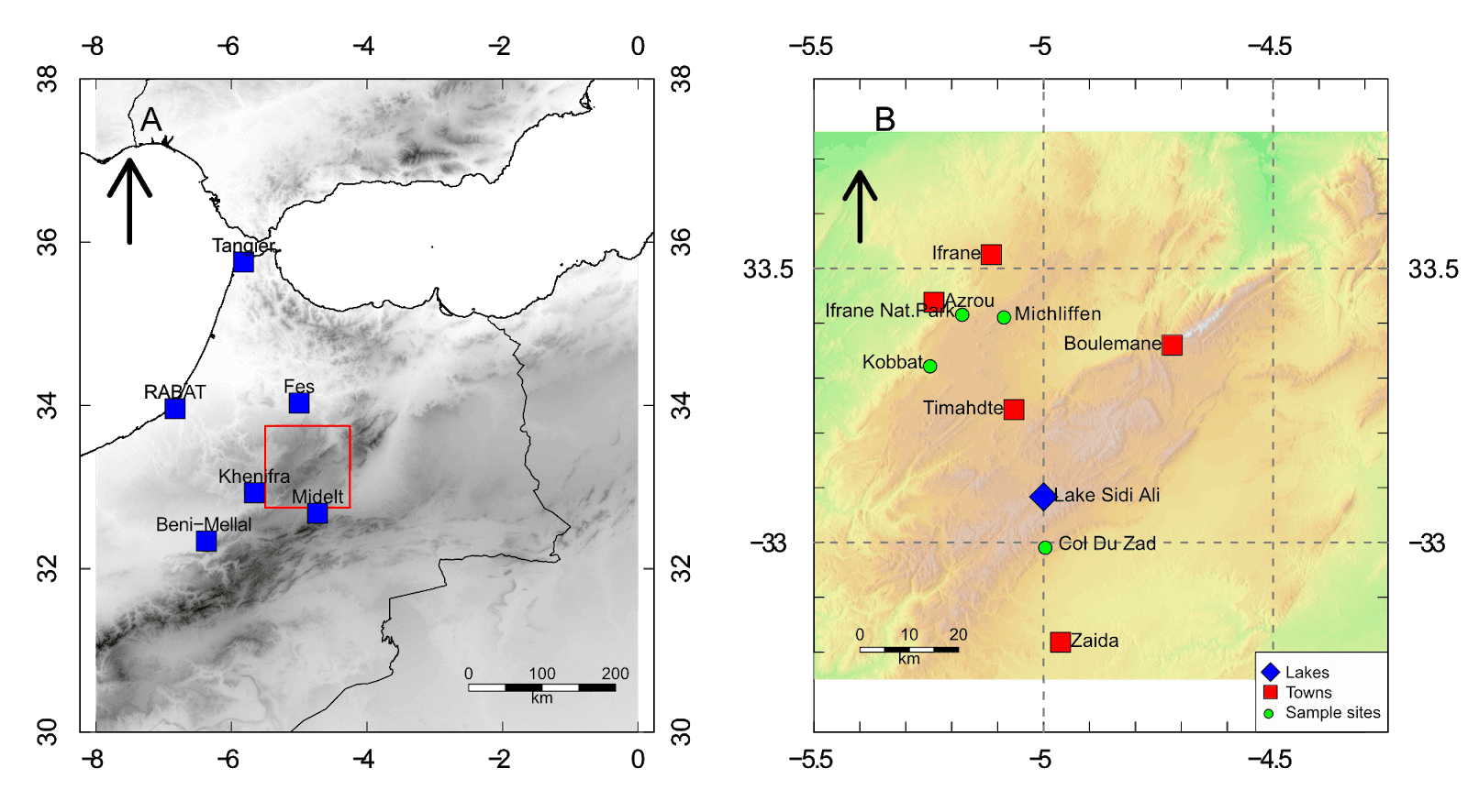
The result is a location map which shows an overview of the area, with a close-up of the study location. As you can see, there are a few issues with the maps not filling the whole plot region (see the next section to solve this issue), and there is some text clipping (text position can be adjusted, or fixed in a graphics editor).
But overall, R can produce good looking maps with ease, without the use of a GIS program! And of course, since it is R, absolutely every part of this map can be customised.
plot() vs image()
One way to ensure the map fills the entire plot region is to use the image() function, rather than plot(). This function is also beneficial as it allows you to increase the number of pixels used to render the map, which will create high quality figures. The downside to using image(), is that it does not create a legend - so you would need to create this separately using plot() and add it to the map manually with a graphics editor.
We'll recreate the map from the previous section, only this time we'll use image(). Rather than reproduce the entire code below, I'll just show the parts using image() (the rest of the plot code is the same as the previous section).
# Overview map
image(ma.dem.c, col=over.col(100), axes=FALSE, ann=FALSE, maxpixels=500000)
box()
# Study map
image(hill, col=rev(over.col(100)), axes=FALSE, ann=FALSE, maxpixels=500000)
image(mid.dem, col=adjustcolor(map.col, 0.75), axes=FALSE, ann=FALSE, maxpixels=500000, add=TRUE)
box()
Now the map looks better! Further tweaks can be carried out if necessary, either using R, or a graphics editor.
Thanks for reading, and please leave any comments or questions below.
Further reading
DEMs and where to find them - A look at different freely available Digital Elevation Models (DEMs), where to get the data and how to use them in R.
Bathymetric maps in R: Getting and plotting data - Part 1 of a guide showing how and where to get bathymetry data and how to import it into R.Bathymetric maps in R: Colour palettes and break points - Part 2 of the bathymetry guide taking an in-depth look at colour schemes for raster plots.
A quick guide to pch symbols - A quick guide to the different pch symbols which are available in R, and how to use them. [R Graphics]
A quick guide to layout() in R - How to create multi-panel plots and figures using the layout() function. [R Graphics]
Interpolating gridded datasets in R: UV-B data - How to interpolate gridded datasets and plot them in R.
i would like to thank you for this tutorial, that was very helpfull to me. I would just to ask how can we export the final result as an asc file?
ReplyDeleteHi, you can save the raster file using the writeRaster() function in the raster package.
DeleteTo save as an .asc file (ArcGIS ASCII), you could try using the following code (as an example):
writeRaster(x, filename="MyMap.asc", format="ascii")
x = the raster you have created. Please note though, that this will only save the raster, i.e. the basemap layer.
Hope this helps.
Thank you for share this super useful tutorial.
ReplyDeleteDear Benjamin,
ReplyDeleteI would like to add the raster color scale as an element within legend. is it possible? if yes, could you suggest me a way to do this ?, please.
Hi, I am not sure what you mean?
DeleteYou can display the legend by using the plot() function - this legend should represent the raster, which in the example above, is the elevation map. This will appear at the right of the map as shown in the examples at the start of the guide.
If you use the image() function, it does not produce a "raster legend" - so you would need to do both. Use plot() to get the legend, and image() to get the higher quality map. Use a graphics editor to merge them together.
Best wishes.
Hi Benjamin, I am sorry, I did not express well.
DeleteI mean, when I use plot(raster, legend=F), I would like to add a new legend for the raster within function legend(). is it possible? Thank you again.
For the legend() function, I think this only lets you add points and text - and not the raster legend - which you can only get using plot(). But, I am not 100% sure on this :)
DeleteHi Ben, great tutorial! THanks for sharing!
ReplyDeleteIn the overview, how do get rid of the extra blank space that extends beyond longitude O and -8?
WHen you show the transition from the terrain colors to the black-and-white map those sections are gone, but I think you don't show how.
Thanks
Hi Nico, one way is to resize the plot window in R to match that of the map… although I’m not sure if that’s possible in RStudio.
DeleteThe other way is to use the image() function rather than plot() as that will fill the plot area. (I go through this at the end of the guide).
Best wishes,
Ben